The rapid development of technology has significantly influenced the trends in website design. Those components and design details that were once considered cutting-edge have now become obsolete, overused, and too generic. The last thing you want is to lose potential conversions because of an outdated appearance or failure to meet basic web standards.
Fortunately, Agilie studies the latest trends to create high-quality websites that are not only exceptionally effective but also impressive in design. We invite you to familiarize yourself with the latest breakthroughs, digital trends, standards, and predictions for 2024.
To keep up with users’ constantly changing needs and preferences, the design elements of existing websites should be updated regularly and created based on fresh trends. So the question is: “What are the current web design trends and how to take advantage of them now to stay afloat in the future?” In our previous article, we talked about Mobile App Design Trends.
We encourage you to keep reading our newest blog post, in which we’ve picked the 15 recent web design trends that can help improve your brand awareness and business.
While cinematic scrolling and digital glitches employ striking animations, custom illustrations, minimalist palettes, and broken grids leverage straightforward techniques and impactful design to honor the human ingenuity driving technological advancements. Regardless of the advancements in artificial intelligence, one can confidently predict that 2024 will usher in a diverse array of web design trends.
Revitalizing your website design has the potential to significantly enhance your brand and profitability. If you require a contemporary and high-performing website, do not hesitate to contact our team today.
Trend #1: Responsive Web Design
In the web design and development industry, we are quickly reaching the point where it is difficult to keep up with the endless stream of new resolutions and devices. For many websites, creating a separate version for each resolution and new device may be impossible, or at least inefficient. Should we tolerate losing visitors from one device in favor of gaining visitors from another? Or are there other options?
Responsive web design is a strategy that recognizes that design and development must adapt to user behavior and environment based on screen size, platform, and orientation.
The practice is a combination of flexible grids and layouts, image optimization, and clever use of CSS media queries. When a user switches from a laptop to an iPad, for example, the website automatically adapts to the resolution, image size, and script capabilities. Their device settings may also need to be considered, for example if they are using a VPN for iOS on their iPad, the website should not block the user from accessing the page. In other words, the website should have technology that automatically responds to the user's preferences, eliminating the need for separate design and development phases for each new gadget on the market.
Trend #2: Mobile-First Design
Mobile-First Design is becoming key to customer engagement as mobile devices are at the heart of the digital revolution of the last decade. So, given that approximately 54% of web traffic is generated via mobile devices, a mobile-first approach is becoming a defining factor in the market.
A mobile design bet, or a mobile approach, allows web designers to develop a product for mobile devices first. This means sketching or prototyping your web design specifically for smaller screens, gradually transitioning to larger ones.
Prioritizing Mobile-First Design makes sense because there are space constraints on devices with limited screens, and teams need to ensure that key elements of a website display well for all users.
Designing for small screens forces designers to strip away the excess and leave only what is necessary for effective website rendering and navigation.
Mobile devices have become an essential part of the web landscape and will continue to be key in the future, especially since they account for more than half of web traffic. Don't forget that mobile users already outnumber desktop users, with a market share of 60.43% according to Statcounter GlobalStats.
Trend #3: Flat Design
Flat design is a style of user interface design that uses simple two-dimensional elements and rich colors. It is usually compared to the skeuomorphic style, which creates the illusion of three-dimensionality by copying realistic elements. The popularity of flat design has blossomed since the release of operating systems such as Windows 8, Apple's iOS 7, and Google's Material Design that use this style.
Flat design was originally developed for responsive web design, where website content scales smoothly based on the screen size of the device. By using simple shapes and limiting textures, the flat design ensures efficient responsive design and fast loading (especially important for mobile devices with slower internet speeds). By reducing visual noise in the form of textures and shadows, flat design creates a simplified and optimized user experience.
Trend #4: Geometry
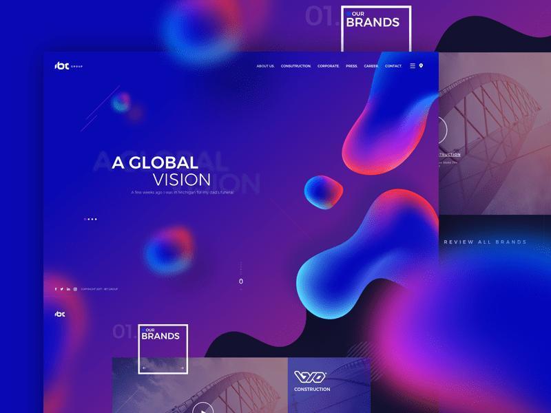
From squares and rectangles to triangles and hexagons, geometric patterns, shapes, and lines are taking web design to a higher level. Geometric forms are associated with modernism. Nowadays, when most designs strive for clarity and simplicity, the laconic forms of geometric shapes are extremely suitable for the wise placement of content and images as they don’t overload the layout and make websites and apps look better-structured and organized.
If you are looking for inspiration about how geometric shapes can be applied, take a look at some awesome examples as well as find out what patterns and techniques are the hottest across the web.
Trend #5: Illustrations
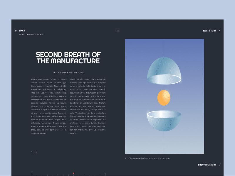
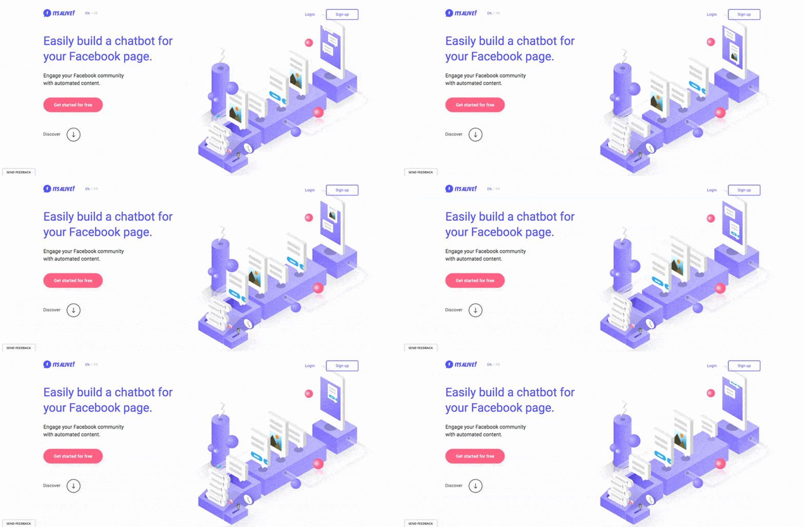
Today, designers are actively using illustrations to get unique images instead of stock photos. They strive to create special illustrations or icons adjusted to each customer. In 2024, hand-drawn illustrations will likely be in demand, and here is why:
- Illustrations can help appeal directly to the users’ imagination and help them strengthen their connection with a website.
- Utilizing illustrations gives more control over the content of the image and its details.
- As a rule, illustrations can be a cost-effective method, as it is cheaper than organizing a photoshoot, and it can also give you the capacity for your creativity and individuality.
The reason most designers gradually abandon the use of stock images is that nobody wants his/her work to look like a cliché. The same goes for brands that struggle to stand out from competitors. The constant use of stock images can reduce the brand’s originality as well as cause a risk that some elements can be seen in the works of other designers.
In 2024, the Art Deco style is anticipated to gain popularity in the realm of aesthetic website design. Characterized by its use of symmetrical and geometric shapes, Art Deco is often employed to craft appealing and decorative patterns that alleviate visual stress through the incorporation of geometric elements. Consider incorporating Art Deco into your web project, as despite its age of over a century, this style maintains its freshness and novelty, rendering it appealing for contemporary design.
Art Deco motifs are well-suited to the geometric patterns that have enjoyed popularity in recent years. Beyond its association with the era of the Great Gatsby, Art Deco can embody not only elegance and refinement but also minimalism, making it an excellent choice for website design.
Trend #6: Animations
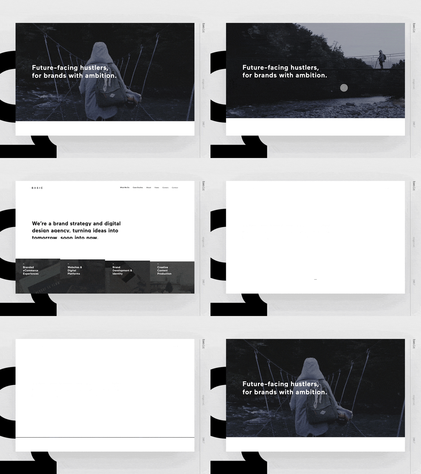
Another popular trend is animation. Animated elements are broadly applied on various websites as they can quickly attract visitors’ attention. The idea of using animation in web design is not new, however, in 2023 this trend continued to gain momentum. Furthermore, given the increased number of professional tools for creating animation, we can suppose that motion graphics will become more attractive and exquisite.
The animation is an extremely useful tool in web design unless it is used solely for decorative purposes. Today, designers create animations using JavaScript and CSS, which helps to add moving elements on the website without overloading it. More importantly, animations are now used to improve website usability rather than just for fun. Animation is a great tool that makes websites better and easier to use.
Trend #7: Microinteractions
Every day we perform hundreds of extremely simple actions, like pressing the elevator button or “like” someone’s post on Facebook or Instagram. We do this consciously, almost automatically, not thinking about the sequence of our actions. We used to call it microinteractions. Microinteractions are contained product moments that revolve around a single use case. They are details that happen when we perform a certain number of tasks. In other words, microinteractions help websites and apps feel little more human by offering the user acknowledgment.
Despite all the simplicity and evidence of certain virtual acts, the web design microinteractions can be decisive. We send exchange messages, like someone’s food on Instagram or share important messages on Facebook. Appropriate design of such interactions allows working with website intuitively, while inappropriate can lead to user’s disappointment due to the obvious quirkiness and poor functionality of the Internet resource.
Trend #8: Broken Grids
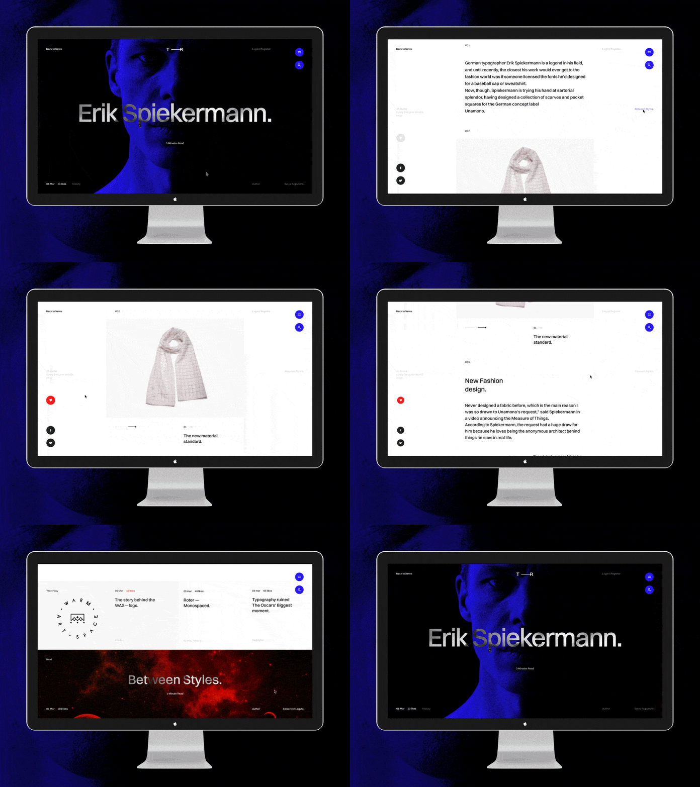
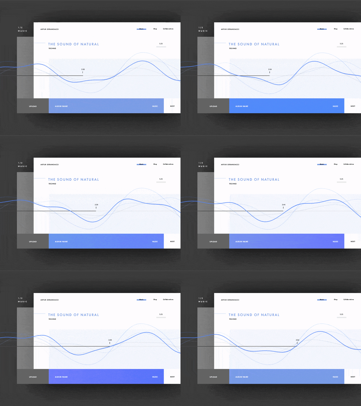
Broken grids contribute to the quick and effective perception of information by users, adding uniqueness and originality to a standard design. A torn layout can include changing the width of columns or overlapping elements, adding animations, and more. Designers can create unique experiences for users, allowing you to stand out from the competition. Broken grids are also great at telling a coherent story if the design is masterfully thought out, inspiring users to pay attention from point to point on the page.
Trend #9: Bright and Saturated Designs
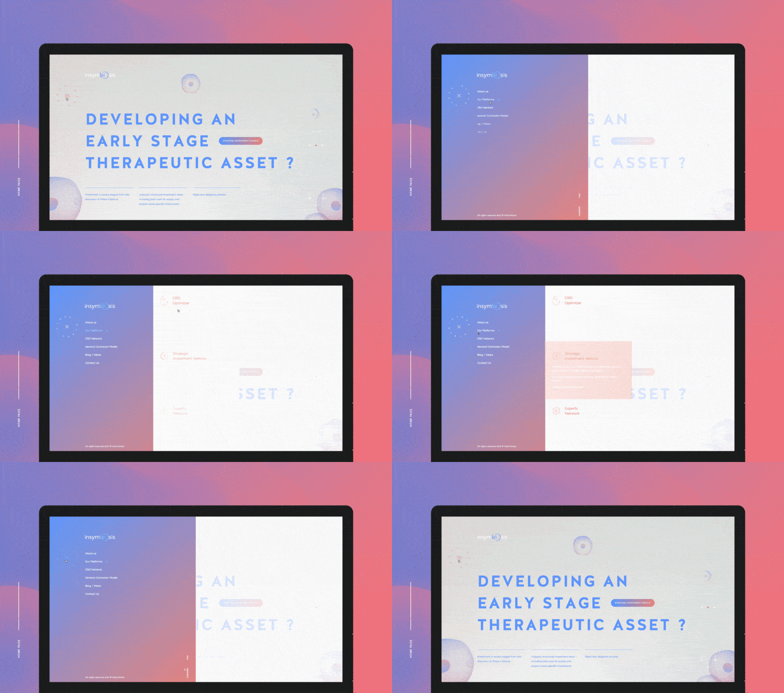
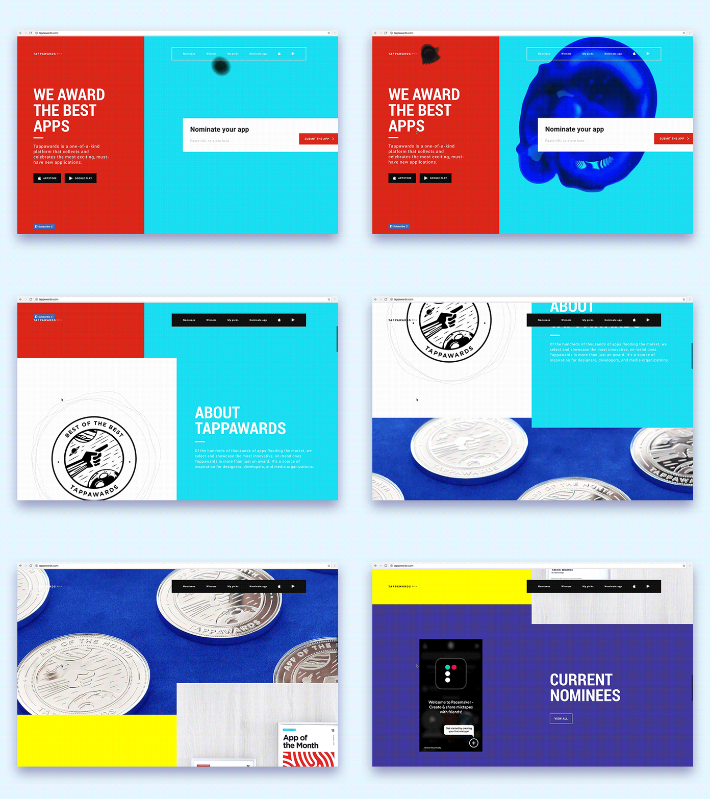
Minimalism is stepping back in 2023 and we expect to see more brands turning to bright and saturated colors. Different colors and gradients can help the user to better distinguish the content on your website. With the right chosen colors, you can significantly improve your website conversions. According to Colorcom, when making purchasing decisions, more than 92% of people base their decision on visual factors, mainly colors.
In fact, what seemed to be a trifle can significantly improve your website conversion, thus leading to higher brand visibility. A recent MOZ case study proved that changing the color of a button text from green to yellow resulted in 187.4% increase in website conversions!
A good example of the color combo is duotone. Duotone is a combination of the color spectrum of two colors. It can be shades of two colors or completely opposite tones. In web design, the duotone is often used as a color stabilizer and can help create a dominant image as well as increase readability of the text by giving more space and contrast.
Trend #10: Cinematic Scrolling
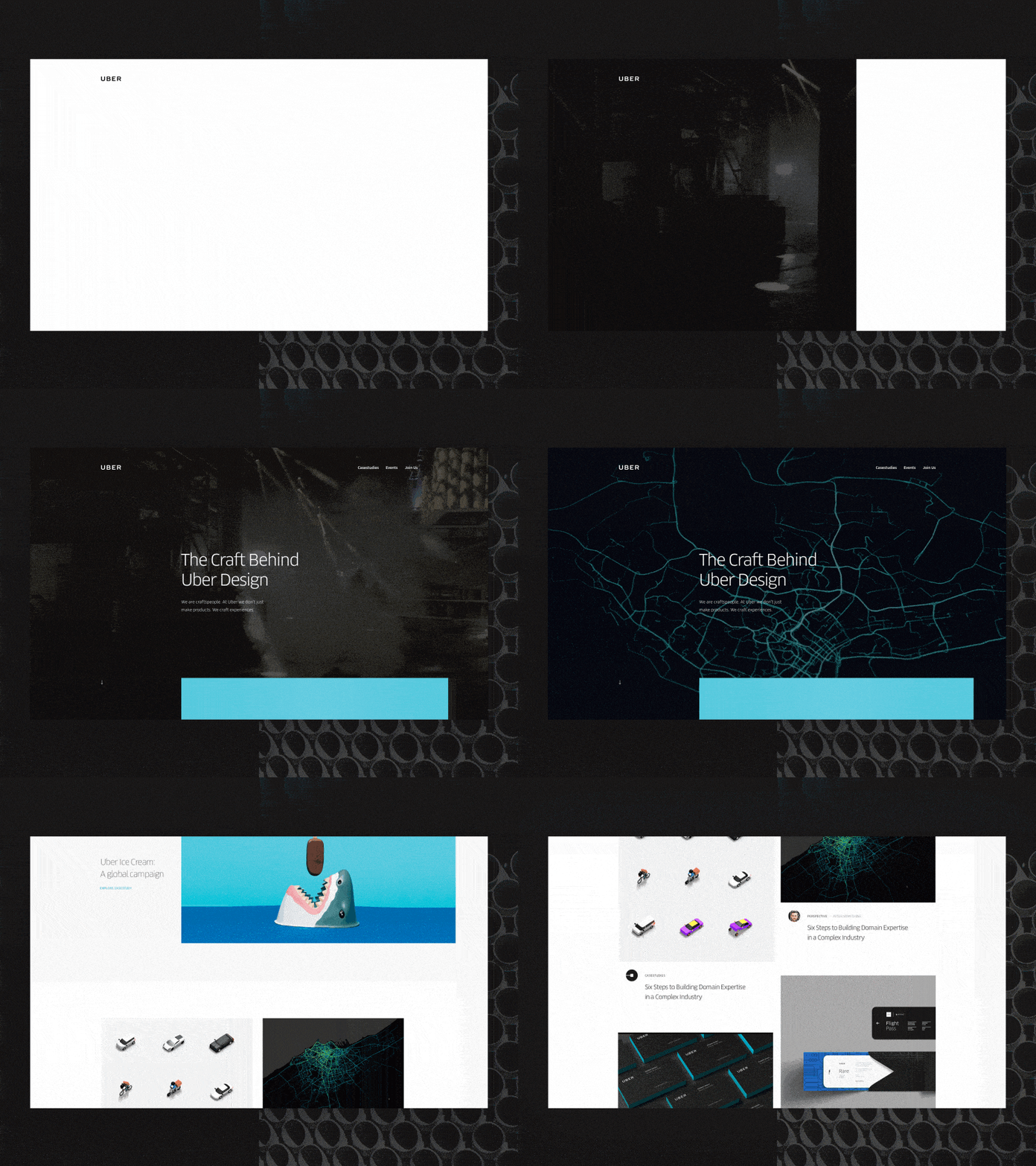
The popularity of cinemagraphs is growing by leaps and bonds. Cinemagraphs are characterized as photos with elements of a video that make websites look more stylish and engaging. Cinemagraphs are eye-catching and can easily appeal to users. The main reason to use cinemagraphs on your website is that they help to better communicate with visitors as well as breathe life into your website or app by giving a degree of depth with movements on a high-quality photo.
This cinematic scrolling trend takes advantage of full-screen display and standard cinematic techniques such as slow zoom, 3D rotation, and the use of long shots with tracking effects. In contrast to the diversity of these impressive plots, they also convey the artificiality of the Internet space. Like a movie, visitors feel that the website has been created with care, as if by the hands of a master.
This trend often requires a large budget and is most often used for 3D animation of products. The cinematic approach lends drama to the product, making this trend particularly suitable for companies offering high-tech or innovative products — much like a mysterious movie trailer that captures the imagination with its unknown future.
Trend #11: Video Backgrounds
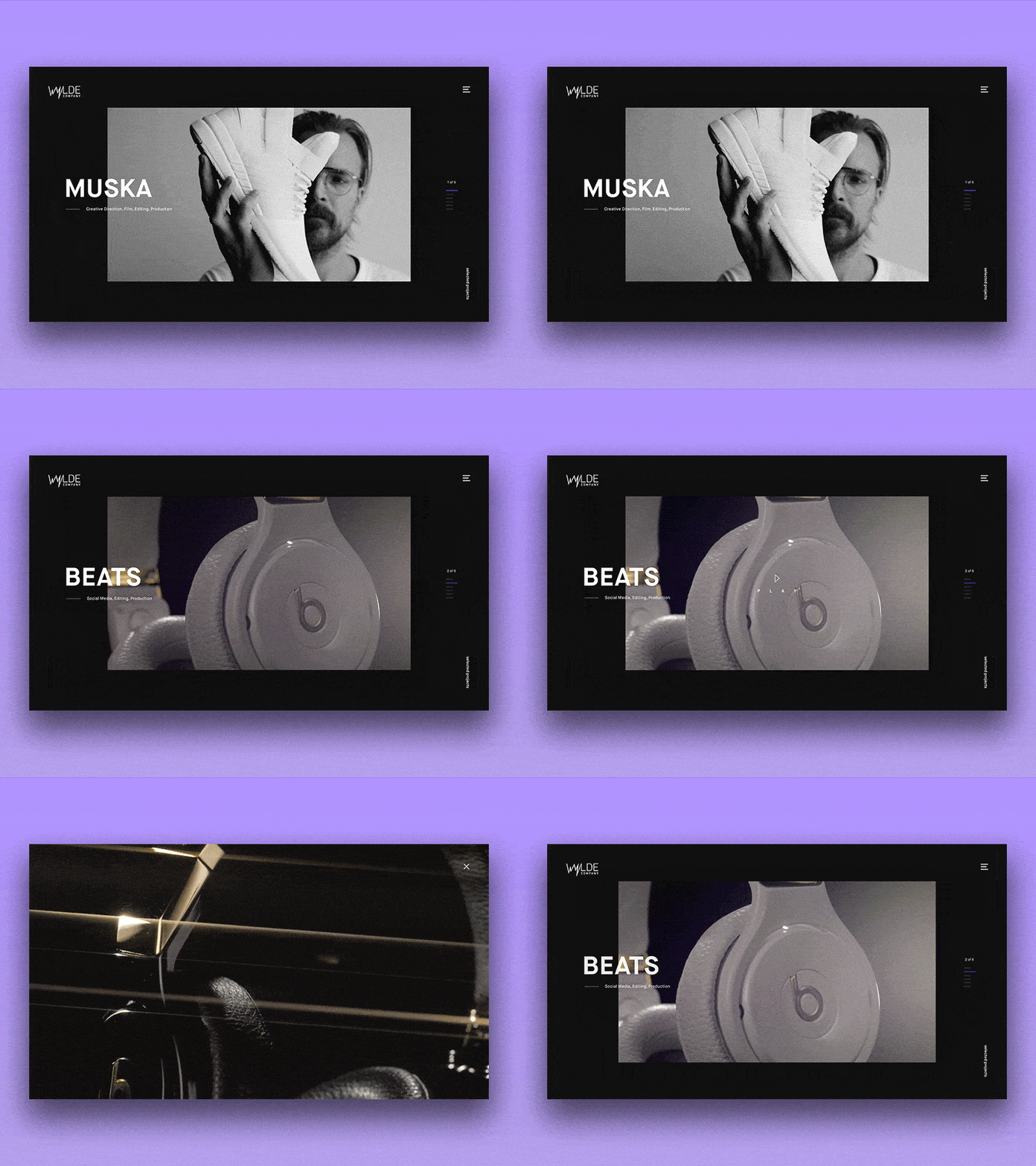
Video Backgrounds are gaining popularity in modern web design. It's now easier than ever to send impressive, high-quality video, even with affordable hardware. As Internet speeds increase, more and more websites use meaningful files such as videos.
It is obvious why this trend is gaining momentum. Full-screen background videos create an instant visual impact for site visitors. However, there are several important aspects to consider when using them on your website.
- Mute by default. Playing sounds without warning may turn visitors off. It can be unpleasant and unexpected. Even worse, the visitor's music or video can be played in parallel.
- Compress video to optimize size. Not every video needs 1080p Full HD for quality playback. Many users are limited by Internet speed, especially on mobile devices. Optimized files will make downloading easier.
- Make sure the user can turn on the sound. If audio is an important part of the video, give your visitors the option to activate the sound. This can be implemented using a popular video sharing service such as Vine.
- Use Vidbg.js to set video backgrounds. This plugin provides an easy way to add a background video with just a few lines of code.
- Host videos on Vimeo Pro or Amazon CDN. These services provide fast hosting on servers with the ability to handle large files. In addition, they stream videos to users, reducing the waiting time before playback.
By keeping these guidelines in mind, you can make the use of video backgrounds on your website more effective and enjoyable for users.
Trend #12: Typography
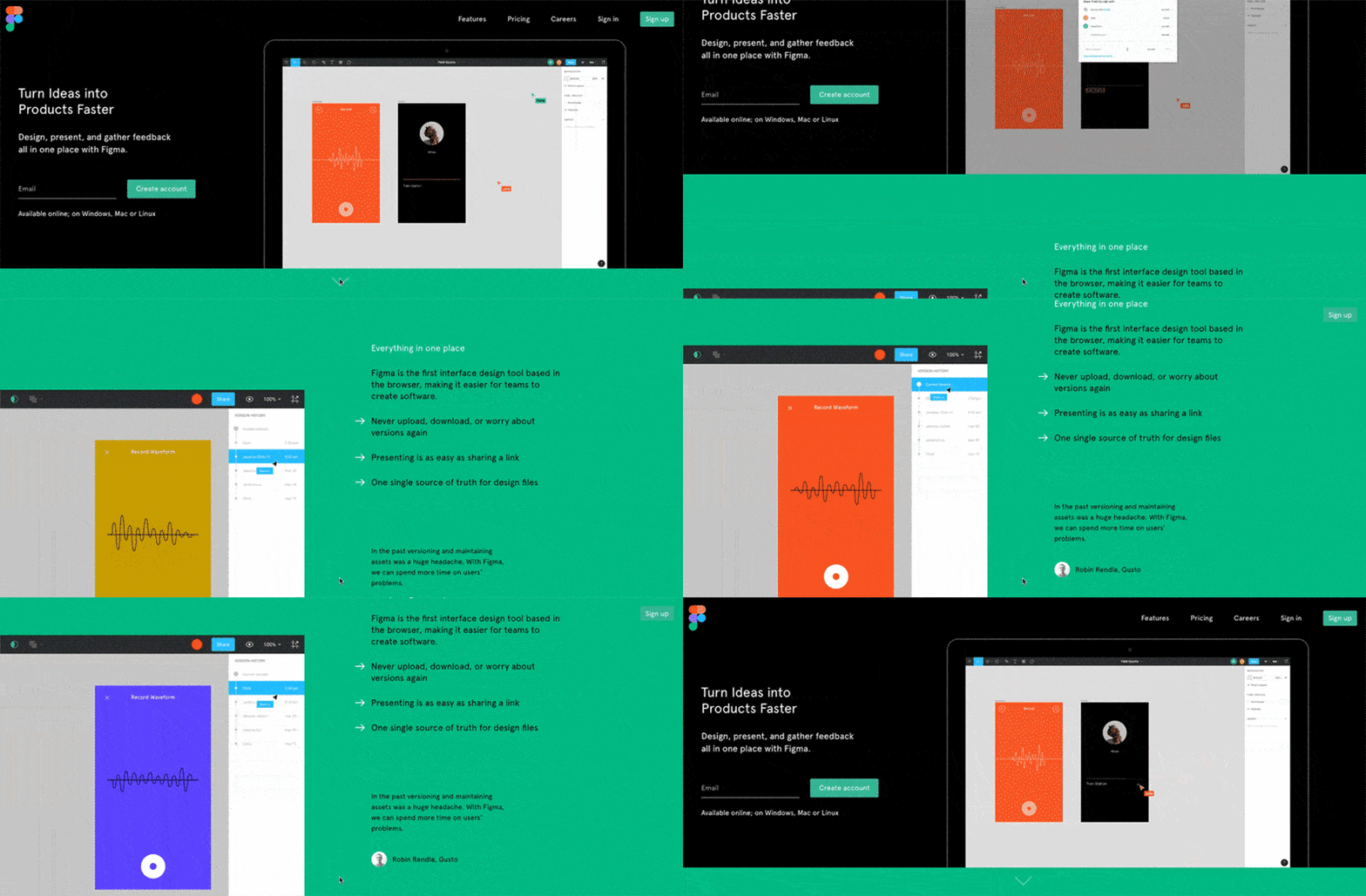
The goal of a font is to be as clear and easy to read as possible, and often this is achieved without the reader even consciously realizing it. On the other hand, the trends of 2023 increasingly resort to experiments with distorted fonts that border on absolute illegibility. The use of grain, noise, and texture effects in graphic design is even more impressive, especially for a Gen Z audience. Whether it's letters that twist into knots or fonts that split, distorted typography gives the text an unusual look. There are no rules in the world of warped fonts, as you can stretch, twist, contour, or squish typography without any restrictions, experimenting with its shapes and structure.
If the text on your web page is going to be long, make sure that it is readable as well as pleasant to readers’ eyes.
Typography is body language. Very often the role of typography in design is underestimated, and more attention is paid to illustrations, photos, or other graphic elements. Good typography can lead to a significant improvement in UI and UX. The designer is responsible for organizing words and letters in a way to convey a message that will evoke emotion and set a tone. In most cases, typography is about visual effect rather than text. Well-structured typography can greatly support your overall design.
If you are looking for ideas or inspiration for using typography on your website, check out Typewolf or Nurture Digital. These are great sources where you can delve deeper into digital typography.
Trend #13: Scrolling
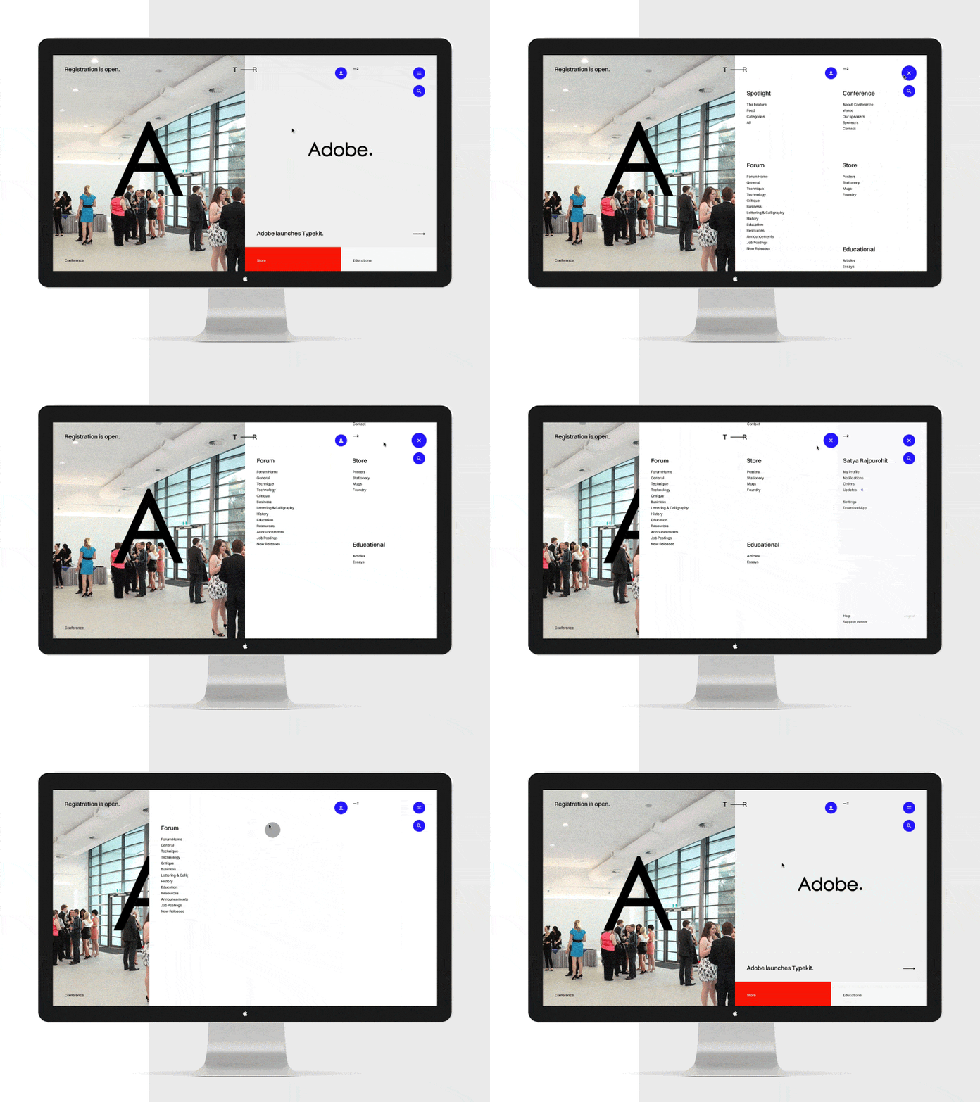
There were times when designers criticized scrolling (whether it’s vertical or horizontal). However, in the era when mobile is becoming the leading digital platform, the action of sliding content across monitor or display is gaining its popularity and becoming one of the key elements in the list of the latest web design trends. Scrolling allows you to easily navigate through web pages while eliminating the need for additional clicks. In general, scrolling changes the approach to web design, focusing more on the user’s needs. Long scrolling websites are very adaptable, and they encourage users to stay longer on the web page.
Trend #14: Digital Glitch
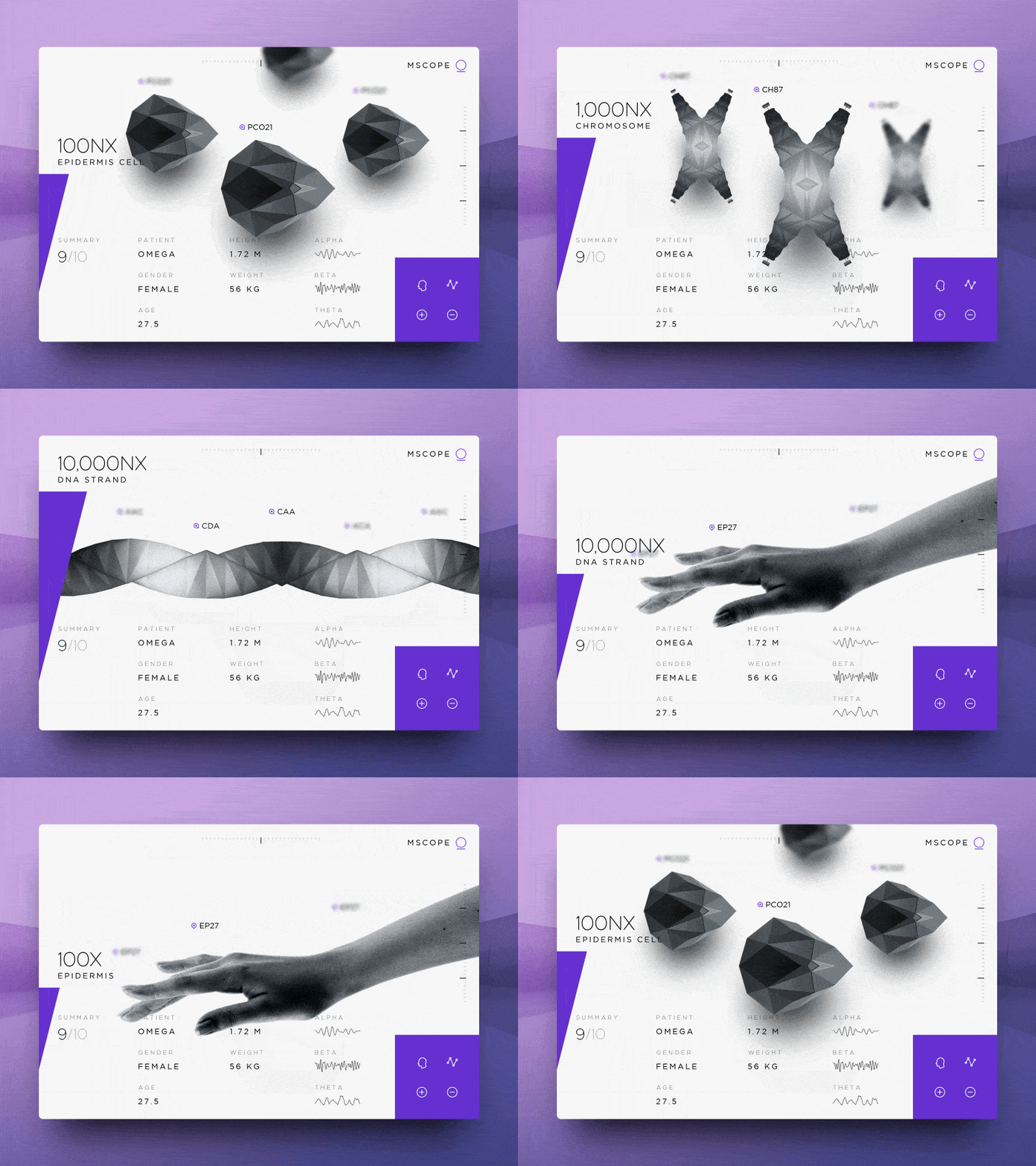
Digital Glitch continues to be relevant even in the high-tech world of the Internet. In 2023, web designers are returning to machine glitches that are reminiscent of the analog era, when technology was not yet so advanced. This trend greatly expands on last year's 90s website revival, when designers abandoned the rules and embraced the early Internet.
While the 2023 design glitches go back to days gone by with digital clock fonts, cyberpunk neons, and VHS screen tearing effects, it also looks to the future. This makes it especially popular among software brands working in the fields of artificial intelligence, cryptocurrency, and other modern technologies.
This futuristic approach is strongly linked to the impressive technology of glitch design, where websites are cleverly animated to appear unintentionally malfunctioning. This approach also embodies the post-design ethos, rejecting the grid order for websites that aren't afraid of looking chaotic. Even if the trend toward technological disruption may suggest dystopia, there is a certain comfort in websites that welcome disruption and find beauty in flaws.
Trend #15: Emphasis on Landing Page
A famous actor, Will Rogers, once said: “You will never get a second chance to make a first impression”. Think of your company’s website as a crucial step in establishing a good connection with your potential visitor, customer or user. The aim of a landing page is to capture visitors’ attention and turn them into potential leads. Every business craves for having a creative and a unique landing page in a way to introduce the product’s features and benefits in a good light.

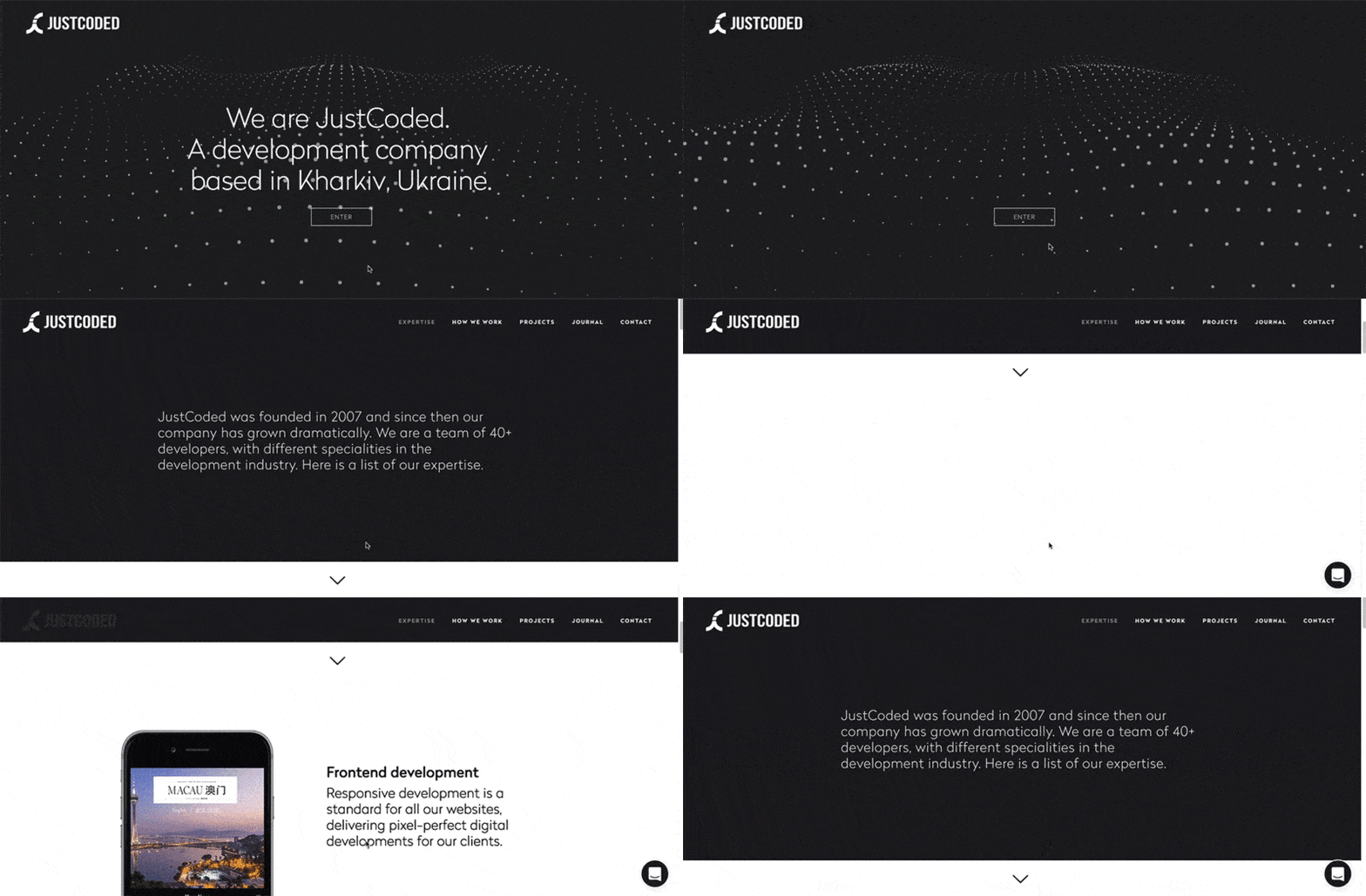
A good designer aims to create a product that will work on multiple devices and attract a global audience. Keep in mind that responsive design can change the way brands interact with consumers.
There is a logical development towards service design and visual trends replace one another. Interfaces are moving away from the “picture” to “interaction” and, for this reason, motion design in terms of the amount of information delivered to the user is almost equal to graphic design. There is a continuous standardization of UI design. The quality of mock-ups, ready-made animation scripts, color palettes has grown significantly. It helps designers to create a harmonious and effective interface, spending a minimum of resources on developing a visual style.
At Agilie, we pay close attention to the constantly changing trends in graphic and web design that allow us to be at the forefront of web development. You may ask why it’s so important for you to know those trends if you are not a designer or a web developer? Well, it’s not a secret that for a business to be successful, an online presence is equally important as an offline one. With the website being your business card, it is important to know how to attract more customers through visual content.
Ready to start applying those new web design trends, contact our team!