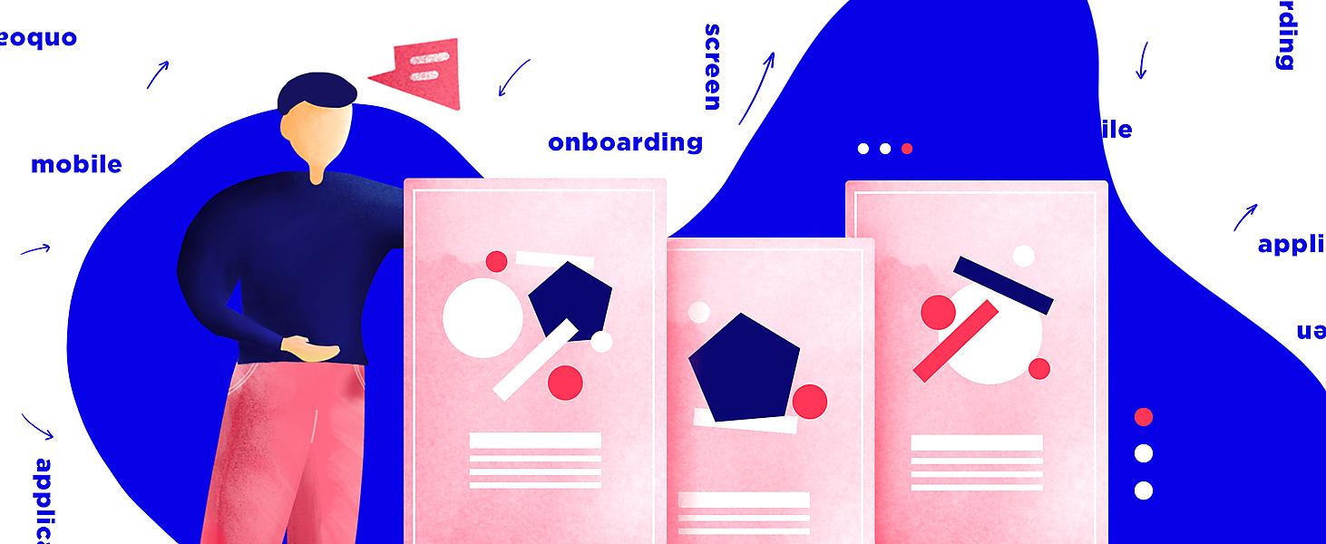
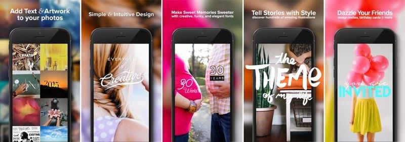
App screenshots can be different: bright or inconspicuous, neutral or expressive... The main thing is that they strike the eye and invite attention. It's your chance to win the customer and make him join the number of your loyal users. And best screenshots cope with this task with a bang.
Here are some statistics to prove the point: according to StoreMaven's research, at least 60% of people decide to install a mobile service within the first 5-7 seconds. So you have less than 10 seconds to impress your potential user.
Therefore, you need to be very skillful in presenting your product... and app screenshots for App Store and Google Play are great helpers in that sense.
If you're not sure about the effectiveness of your application page design, spare the time to read our new article. It won't be aimless, for we're describing 10 simple ways to create app store screenshots from scratch or improve existing ones. Surely, you'll find something useful for yourself too. There is a strong word that specialized mobile app development services can be used to design and develop functional and interactive business apps suited to an app store.
Why bother designing app store screenshots?
The first impression is really crucial, in the long run, it's the only thing that matters. A bright and interesting image is going to catch our attention and make us click and download the app itself.
Let's give an example.
You walk past a store with a bright, inviting shop window displaying the products you need. Of course, you'll slow down, stop, and examine it, right? You may even enter the store and buy something.
The situation with app screenshots is similar: they invite the user ‘inside’, figuratively speaking, and improve the conversion rate by up to 20% (as SplitMetrics research says).
Now that the role of Google Play & App Store screenshot design is more or less clear, we’d like to discuss the simplest ways to make it better.
#1. Don't neglect Google Play & App Store screenshot guidelines
You don't have to reinvent the wheel to design app store screenshots. Apple and Google have already taken care of you with their detailed recommendations. So if you don't know where to start, just follow their simple and straightforward guides.
Though, it’s important to stick to the golden mean and be creative. Remember: Google and Apple only recommend you, not order. For example, both platforms allow uploading a large number of images (up to eight Google Play store screenshots and up to 10 App Store screenshots), but it doesn't mean you should use all 8 (10) ones. 40% of developers limit themselves to 5 pieces, and in most cases, this is really enough.
In other words, be flexible!
#2. Consider competition
Any business has competitors, there's no escaping them, no matter what you do. Therefore, we advise you to benefit from their experience. To be precise, why not study how the owners of successful apps design pages in Google and Apple stores? You can follow their lead!
In fact, there are 2 main strategies:
-
Act by contrast. Do your utmost to surprise users and come up with an unexpected idea for designing app store screenshots (which won't be similar to what your competitors are offering).
-
Improve what you see. Most of the time, the best way to act is to take a competitor's concept as a basis and improve it a bit by adding special appeal.
If you yourself cannot decide which strategy is more winning, hire a team to help you decide on the perfect design option. They’ll know what to do.
#3. Pay attention to the format of app screenshots
-
Horizontal or vertical ones?
There are 2 classic screenshot formats, horizontal and vertical. Which one to choose depends on many factors, including your application type (let's say, games look better in landscape orientation).
According to statistics, the majority of developers (over 92%) prefer the vertical display of Apple screenshots. As to Play Store screenshot design, both formats are quite demanded (the share of vertical ones is about 54%).

Be aware that vertical screenshots displayed in App Store searches may look poorly readable. Therefore, it's sometimes wise to use a horizontal type of orientation to highlight the call to action.
-
What about app store screenshot sizes?
Mobile devices have different screen resolutions, as you can imagine. And this should be borne in mind when creating screenshots.
In the case of Google Play, everything is simple: the platform only requires the minimum and maximum image size. Alas, the situation with Apple is more complicated, and developers have to add screenshots for every possible screen size of iOS devices.
#4. Choose the correct order of screenshots for Apple Store & Google Play
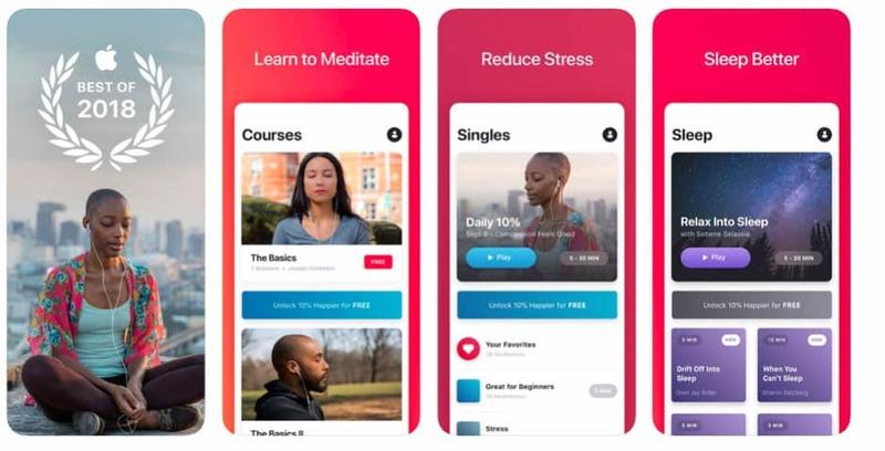
The main purpose of app screenshots is to let the user know whether he needs to download an app or not. That’s why the 1st image should be as informative and attractive as possible. It must catch the eye and draw the user's attention.
In the matter of the rest of the screenshots, they have to tell the user some fascinating story.
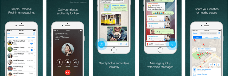
A good example is WhatsApp (see above). Since its goal is to prove a secure and convenient real-time messaging system, the Google Play screenshot series starts with a picture illustrating this very feature; moreover, the descriptive text has been added to each image.
By the by, speaking of the text…
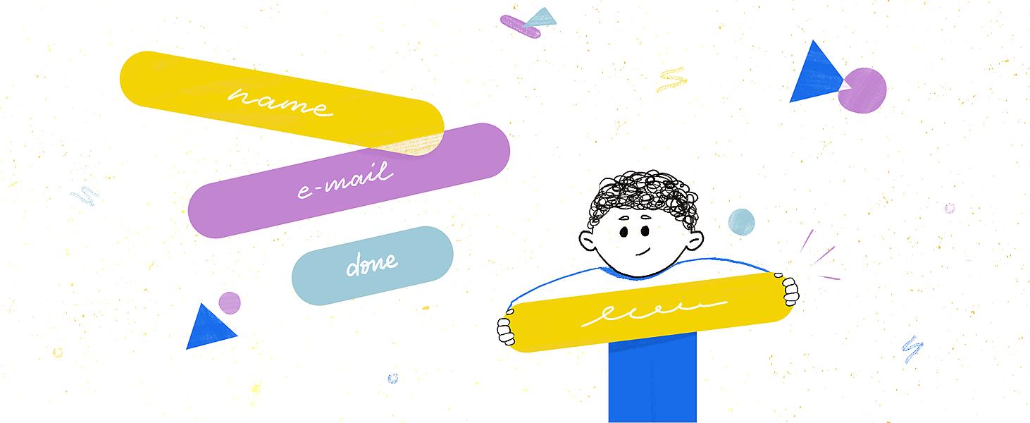
#5. Text also matters
Inexperienced users cannot always understand what exactly is shown in the screenshot, what tasks the application performs. This is especially true for mobile services with original functionality. And in these cases, it’s worth supplementing the image with a text message.
Naturally, the text should be concise and clearly describing the operation of your application, its main features. Avoid any ambiguity and choose a background that makes your catchword easy to read.
The formula is simple: beautiful pictures PLUS convincing text EQUAL the best app store screenshots.
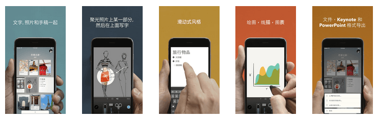
Among other convincing app store screenshot examples with textual explanation is Skyscanner:
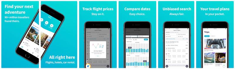
Skyscanner has created a series of great screenshots telling us a compelling story about the opportunity to travel and dream. And how can one resist the urge to click and download an app with such a creative touch?
#6. Use app store screenshots to broadcast your benefits
The application page in App Store and Google Play is a wonderful chance to convince the user that he'll get a lot of benefits by downloading your service. And there are several options for creating screenshots to convey your main app message, such as…
Your app benefits
Your application may have a great number of cool features, but how would a user guess about their existence before downloading the program? Only with the help of text, which supplements the image of screenshots for Apple Store and Google Play! You can delineate the app's functionality or focus on its benefits. Another good option is to describe what user problems the service helps to solve.
Of course, you shouldn't demonstrate too many features at once, concentrate on the most important ones.
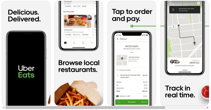
Uber makes good use of such a strategy too.
Say, what comes to your mind when one mentions Uber? Taxi, of course! But no... There is also food delivery from nearby restaurants. And the app store screenshot design you see below is intended to promote this very service.
The way to use your app
If you haven’t come up with the unique benefits of your application or you just don’t know how to word the app features favorably, describe the best way to use your program. Such a method will also have the desired impact on the user.
In other words, you need to convince the user that he doesn't need certain skills to take full advantage of your application.
#7. Add rewards, if any
Does your company have a certain accomplishment you're proud of? Then feel free to use it when designing app store screenshots!
Such achievements include positive reviews from famous people about your service, the won rating, and so on. There are a lot of examples.
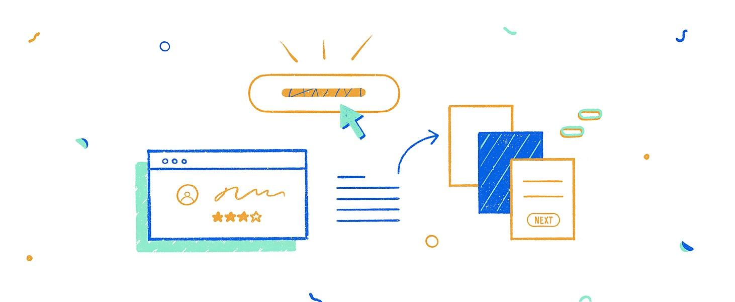
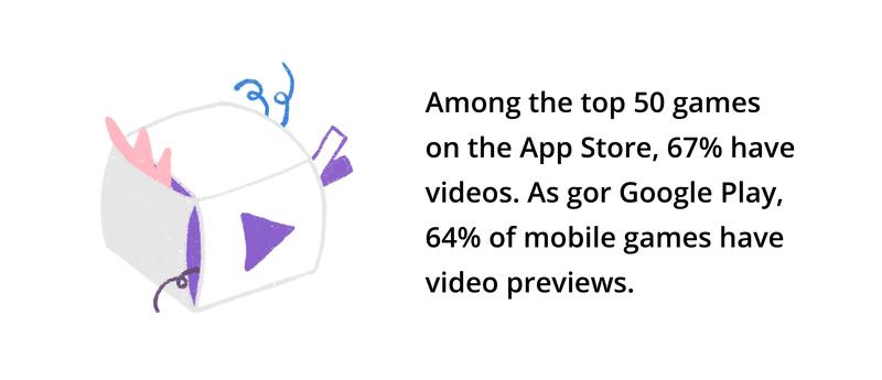
#8. Use video presentation
Google Play and App Store screenshot guidelines allow you to use videos when designing an application page. And we strongly recommend that you don't neglect such an excellent chance to present your product in a more spectacular and effective way.
After all, what could be better than being able to advertise and promote the app's features with a short video up to 30 seconds long? You can add music or voiceover describing the benefits of the service (or whatever you want!). The video, no doubt, will tell more about your favorite brainchild than a dozen of great screenshots.
BTW!
The video in the App Store plays automatically and without sound (you can turn it on if you want), but only if the user hasn't activated the power saving mode. This means you need to work out a noticeable freeze frame.
If we talk about Google, then only one video is allowed, and it is with this video that a batch of Play Store screenshots begins.
#9. Localization when creating screenshots
Of course, you can't forget about the localization of the application page. And if your program works in the markets of different countries, take care of translating the text in the screenshots too.
However, localization is more than just translating text. You have to create app store screenshots matching the cultural background of the specific country.
#10. Don't forget to update your screenshots
App stores give you the opportunity to constantly update your app data, so take advantage of it. Why not, in the end?
Here are some ideas on how to improve your app page:
-
Test different types of Apple Store and Google Play screenshots and, if necessary, correct, and better them.
-
Have you updated the application, added new features? Then be sure to update your screenshots as well! Outdated pictures are of no interest to anyone.
And one more thing: the rules in app stores sometimes change. For example, iOS 13 added a dark theme, which affected the perception of screenshots to some extent. Alas, not all developers took this into account.
Summary
How your app appears on the app store affects our desire to become its user. Put it differently, the decision to download an app or not greatly depends on the sequence of screenshots you created.
This sequence should be logical, compelling, telling a story, speaking to the user in his language. However, it isn't enough to succeed. The application itself has to be cool too, otherwise, even the best app store screenshots won't help you achieve the desired effect.