As the cold statistics say, only 55% of people who open the application in the first week after downloading will return in the next three months. There can be many reasons for such refusal, but one of them is the negative onboarding experience. After all, not every person is able to hunt down a question of using the program on his own, without introductory prompts explaining to him the main details of this process.
Are you convinced of the effectiveness of your own onboarding strategy? We think you should check the issue again because the design is a no less important part of creating a product than its idea, functionality, etc. And you need to be 100% sure that everything has been done correctly.
So, hurry to read our tips for successful onboarding and start applying them to action!
Why do onboarding screens matter?
It seems to be very clear: a well-thought-out mobile app onboarding scheme must simplify the process of the user’s first acquaintance with the program and describe to him its most significant features and benefits.
But in fact, everything is more complicated, and therefore we propose to discuss the matter in order. It's more important than you may think because we’re going to explain to you how to ensure the best onboarding experience. And it’s the only way to keep new users (obviously, you don't want them to leave you and go to your competitors?).
What is the onboarding experience?
A lot of application owners mistakenly believe that the front-rank issue is to find the idea of a product and competently implement it. More far-sighted businessmen understand the equal importance of figuring out a way to attract the maximum number of users. However, it’s not enough either! It’s crucial to turn these found users into your friends - in a manner of speaking. You have to convince them your app will solve their problems and meet their needs. That's why you should think of a successful onboarding process.
Onboarding is designed to increase the likelihood that a newcomer will constantly (and with a pleasure) use your program. Therefore, while working on this stage, devote attention to every detail in order to illustrate to the user as clearly as possible what, when, and why he should do, and, also, what benefits he is going to get thanks to your service.
The purpose of an onboarding process
We'd like to sort out tasks of the mobile app onboarding screens so that things have fallen into place.
-
Training to work with the program. We've said time and again that the app interface should be easy-to-use and intuitive. But even the clearest design won't be enough anyway, and new users will need a little help, a kind of brief introduction.
-
Demonstration of benefits. The sooner a person masters and evaluates the features and benefits the application offers him, the more chances he’ll become your loyal user and even perform the actions you need (say, buy the subscription).
-
Winning the user's heart. Properly done app’s onboarding process allows you to form strong relationships with your users. It all depends on whether you take customer success into account when building your user flows.
Most onboarding schemes are aimed at helping a user create an account and perform other basic actions. But, in fact, this is only the tip of the iceberg. Let’s be honest: the user isn't interested in your app interface. What he really cares about is achieving the desired goal (whatever it is) in the simplest and fastest way. That’s what you ought to tell him about in detail and clearly when designing the onboarding process.
Types of onboarding experiences
To better understand how to implement onboarding screens, let's try to classify the whole thing.
The 1st version of the classification is carried out according to what you’re focusing on:
-
App benefits. You’re telling why the user should download exactly your program. The method is good because you clearly formulate your USP.
-
App features. You’re describing the main features of your application. The option gives an idea about the functionality of the program which means your users will know what they’re dealing with right away.
On the other hand, there is another classification option - according to the type of mobile app onboarding implementation.
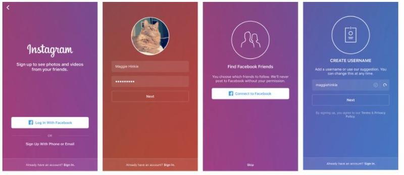
1. Step-by-step instruction
Namely, you offer the user who first launches your app a certain number of onboarding screens (we'll talk about the reasonable number of them later). It’s a popular (but not always effective) approach. Alas, some users skip the 1st step and immediately go to the application itself.
2. Program testing
That is, the person is not just told how to use the application, he can test the process right here and right now. A striking example is Skype bots which check calls.
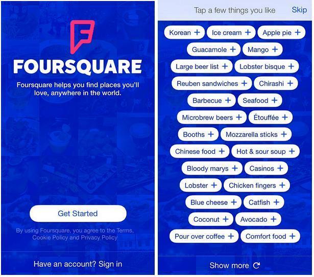
3. Personalization
This customer onboarding strategy offers to specify personal information and suits applications with a variety of content. Among different examples, we’d like to mention Apple Music whose users have to choose their favorite genres and musicians, and Foursquare which asks newcomers to mark items on the proposed list of food instances.
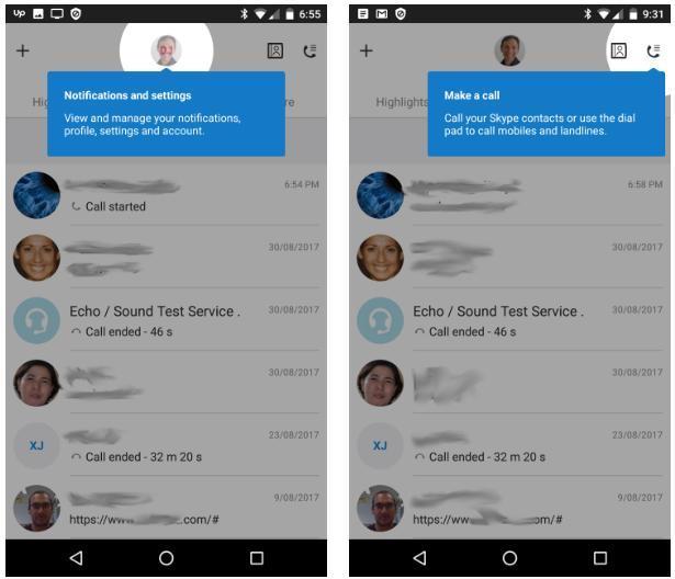
4. Tips at the right moment
Here we’re talking about contextual onboarding which implies the appearance of tips at the right time in the right place - say, you visit a certain app section and get advice on what it is needed for and how to effectively interact with it. It’s a great way to improve the user experience.
However, we'll talk more about these tips in a due course of our article.
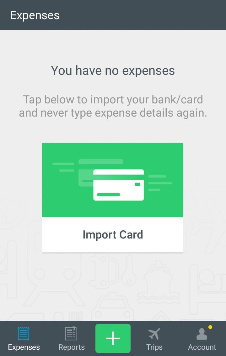
5. Blank screens
We mean screens without content - say, contacts or message templates (of course, they won’t be blank forever). To make the user understand what is required of him here, place a tip in the empty space - all the more so as the empty screen looks flatly and boring.
Expensify application
How to check whether you have an effective in-app onboarding
We think now is the time to move from theory to practice. In the end, everything requires definite and concrete actions, and the app’s onboarding is no exception. The trick is to find the right approach to the problem, and the rest is a matter of experience and patience.
Onboarding techniques for mobile apps
Let’s list the most significant questions you should ask yourself when designing your app’s onboarding experience.
Does my app’s onboarding meet the user's goals?
What is the user's main goal? Why did he choose your application?
We’ll describe the idea by the example of WhatsApp or Viber. The goal of these apps is to simplify communication with the family, friends, colleagues, etc. Consequently, their customer onboarding strategy must be aimed at explaining to the person how to interact with his contacts as efficiently as possible, performing a minimum of actions. In the end, we, the people, are too lazy to take extra steps to get what we want!
To define the purpose of YOUR users and lead them to it.
Is onboarding in my app branded enough?
Branding is an integral part of any successful company, and this applies to applications as well. You must build a memorable image of your brainchild, the one which will be liked and remembered by most users.
Branding consists of numerous stages (the same creation of a logo, as an example) and should apply to various areas of the company. That is, each part of your app (including onboarding screens) must reflect your corporate identity.
Is it clear and simple?
Advice is obvious but helpful. Best onboarding experience is based on clarity and simplicity of instructions. Don't try to be too clever and show off your intelligence, users won’t appreciate too abstruse explanations.
Does the user understand my app’s benefits?
Successful onboarding strategies are always focused on describing the app benefits (or the most precious features). Thereby, they gradually convince the user he’s done the right choice by downloading the program.
Of course, it’s impossible to describe all the advantages right away, so it’s better to highlight a few main ones, the most significant.
Is there a WOW effect?
The WOW effect can also come in handy. Just imagine: the user realizes what advantages your product has and takes advantage of the described features. If he’s impressed, he thinks: “Aha! So this is how it works! I do need it!" You see? The WOW effect in action.
But if it doesn’t happen, it means something went wrong, and you had better rethink your onboarding strategy.
Does your app’s onboarding process include interactive elements?
Cool interactive elements are also used in any successful onboarding process. Statics is the least attractive way to convey your thoughts to a person, not to mention its ineffectiveness. Make the tips dynamic, it’ll improve your communication with the user.
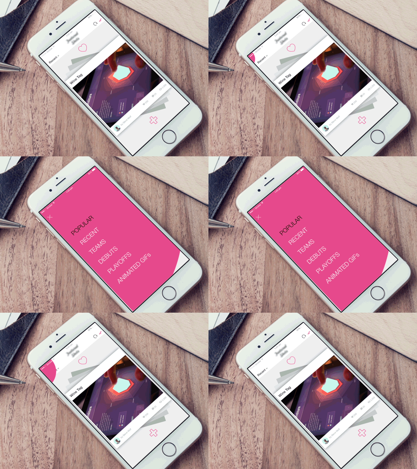
Even such a simple animation effect presented on the concept above gives excellent results.
Aren't there too many mobile app onboarding screens?
Follow the simple rule “fewer words, more deeds”. Designing your app’s onboarding with too many steps, you risk boring the user and erecting an additional barrier between him and the application. Most often, a person has no patience to complete your detailed instructions to the end. Especially since a lot of people find it interesting and intriguing to figure out the work of the program on their own.
The conclusion is obvious: you have to implement onboarding screens in the sufficient, but not excessive, number. There is no need to explain elementary things, respect your user. Focus on what is really relevant.
Isn't there too much information at once?
There is another problem: sometimes the user is forced to remember all the information at once when he first opens the application. Such an approach is absolutely wrong! A person is unable to memorize so many details at a time.
We've already mentioned contextual onboarding which operates on the principle of timeliness (tips at the right moment), and we’d like to remind our advice again. Act step by step, don't overload the user with information.
Do I have a call to action?
Don’t forget to do your best to involve the user in the communication process. Among other things, it requires a call to action, maybe, a sort of feedback. As a result, every person can ask a question if he has faced any problem when exploring your app guide.
Or look at the example below: each onboarding screen of Spotify prompts the user to create an account or log in. It’s a call to action too.
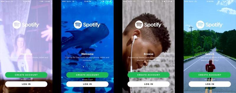
We’ve provided you with some useful tips for successful onboarding, and now you're well-grounded. But it would be nice to know with whom you'll have to compete, right?
Applications you should look at
Our competitive analysis is going to contain a few worthy onboarding strategy examples - those which you have to pay attention to.
Line
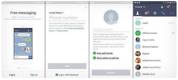
Initially, Line gained popularity in Japan, and then the application owners began to think about the coverage of markets in other countries. And above all, the onboarding strategy had been revised, which ultimately led to excellent IPO metrics.
By the way, Line has chosen an effective method of interaction with a person: beginners can make a detailed product tour and learn all its features, while experienced users are allowed to skip the 1st step with just one tap (and therefore, they don't feel any irritation and have a positive onboarding experience).
invoice2go
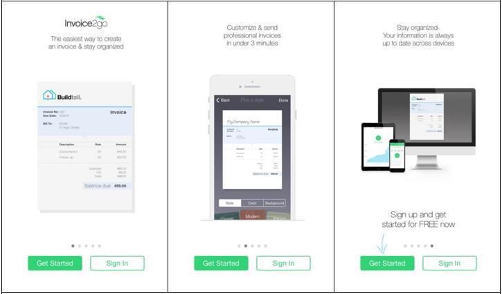
invoice2go is a tool for professional invoicing, which is very popular and in demand among a certain category of users.
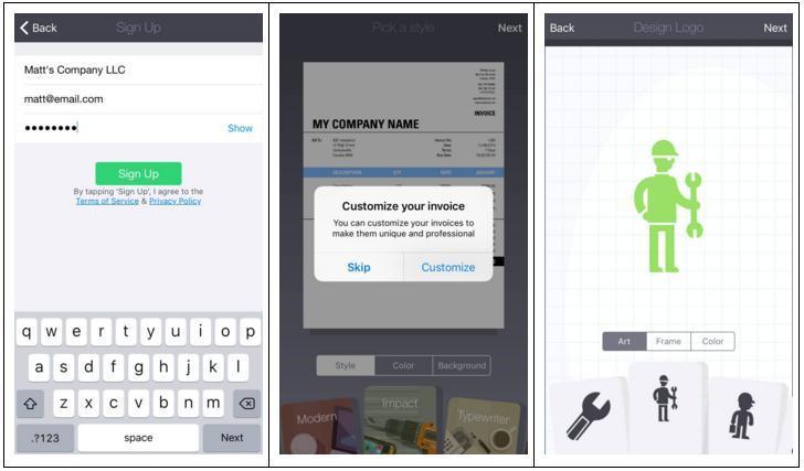
Invoice2go has built the app’s onboarding process on the opportunity to immediately practice invoicing and find out how to act to achieve the result in the most efficient way. Therefore, regardless of user expertise, a person can make the invoice prototype (guided by clear tips). These manipulations are presented as part of its onboarding scheme.
Tinder
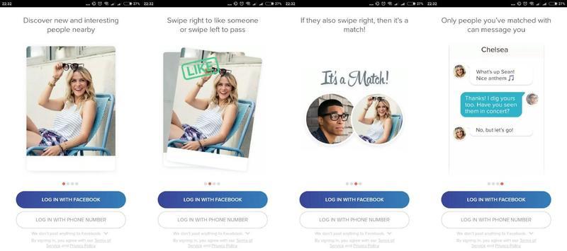
Tinder is a dating app which is well known to everyone. It offers a cool and easy way to find your soulmate using swipes to show sympathy to certain users or weed out unwanted men (women).
Tinder's preliminary instruction is quite simple and consists of 4 screens. And the purpose of an onboarding process here is to convey the app essence and peculiarities of its usage as briefly as possible.
WhatsApp is another onboarding strategy example which leads new users to a key goal in just a few steps. But these steps are really effective!
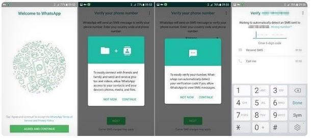
WhatsApp has a lot of onboarding secrets, and one of them is the fact the app doesn't overload new customers with technological terms and little by little explains why the program needs to access contacts, photos, and SMS.
Two Dots
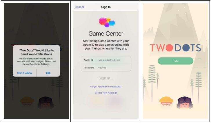
Two Dots is a puzzle game, and its onboarding also resembles a game, and therefore the whole process is intuitive, clear, and fascinating.
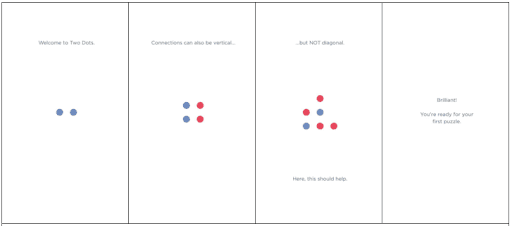
Thus, familiarity with Two Dots is a training which cannot be missed and a game which cannot be lost. All this helps to improve the user onboarding experience.
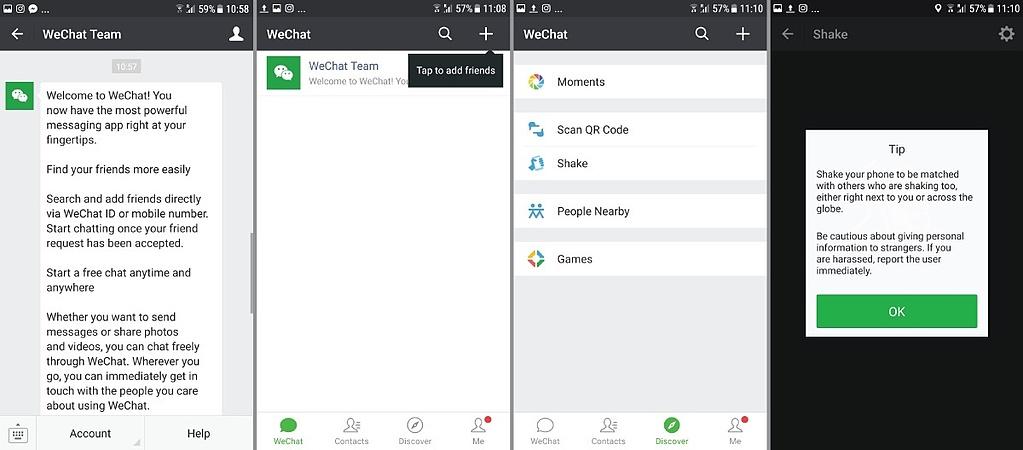
We conclude our review of competitors with an example of another popular messenger. Honestly speaking, the app owners have chosen a somewhat controversial onboarding method, but it should be considered and analyzed anyway.
Instructions on the proper use of the service come in a message and educate people in a practical way. When a person receives a message, he can log in and start taking advantage of WeChat without delay.
However, not all users are satisfied with the described approach, some perceive it as spam.
Summary
Now you know why you must monitor onboarding quality. But let us once again recall (briefly and succinctly) the main points of our article.
So, to ensure a successful onboarding process, you have to:
-
appoint a supervisor (a kind of creative expert) responsible for an integrated approach to creating the best onboarding experience.
-
think like a user. Figure out what a person wants to get through your application and tell him the shortest way to the cherished goal.
-
give the user a choice. Some people prefer to skip the 1st stage, don't deprive them of such an opportunity.
-
use the contextual onboarding technique. The information must be provided step by step.
-
stick to simplicity and avoid complications. Help the user to easily solve the main task he needs to.
-
test, analyze, improve. If you notice that most users skip the app tour, try changing tactics: increase interactivity, formulate tips in a simpler language, etc.
Onboarding can be decisive of the app's fate. Therefore, pre-determine what impressions the user opening your application for the first time should have. That’s how you’ll make the introduction process relevant to his real needs.
Well, we sincerely hope our tips for successful onboarding experience have proven useful. And we're ready to help in a more practical way. If you want, our experts will analyze your onboarding strategy and give advice on how to improve it.
Don't postpone, contact us right away!