You can't make a first impression twice. You have one and only chance to interest people and create a worthy opinion about yourself or your project. And mobile applications are no exception to the rule either.
Alas, it's not enough to develop a good product; it still needs to be presented to the consumer correctly. But how to approach the issue if we're talking about mobile services? Of course, with the help of a cool designed application page in App Store and Google Play! Your task is to convince potential users visiting this page that your program is unique and capable of solving their problems. And it's especially important to see to your screenshots styles.
The fact is, we, people, pay attention to the visual component of any scene or event above all things, which means your would-be user will notice the app’s screenshots in the first instance. And only if he likes them, he might have a desire to read the description and check the reviews.
But how to start app screenshot creation? What to consider in the process? Well, let's have a proper discussion on the matter.
Why screenshots?
According to StoreMaven research, 60% of users make a decision to install an application in the first 5-7 seconds; moreover, the choice is based on the screenshots seen. Well, it's a small wonder… pictures catch eyes better than text.
That's why App Store and Google Play have almost become a kind of digital battlefield. Developers are desperately fighting for users and their attention, otherwise, their applications risk getting lost among other competing services. Naturally, there are many ways to fight, and creating an app screenshot isn't the least of them.
BTW!
No less than 50% of users believe that reviews, ratings, and app page design reflect the quality of the service itself. Unfortunately, we cannot really influence the first two factors (reviews and ratings), but the level and type of screenshots depend on us.
Screenshot technical requirements
Google Play and App Store have clear requirements for screenshots (allowable amount, content, etc.). We won't list all the rules (they may change over time), we'll just give you brief descriptions and leave links to the main sources so that you can find and read complete guides.
-
-
You may add up to 10 screenshots (vertical or horizontal). Acceptable formats are jpeg and png (without alpha channels).
-
You can insert App Preview Video 15-30 seconds long (formats include .mp4, .mov, .m4v).
-
Also, keep in mind that you’re not allowed to use iPhone images when creating app store screenshots. Such a rule sometimes leads to all sorts of difficulties, which we'll talk about later in our article.
-
-
-
The developer has the opportunity to publish up to 8 screenshots (jpeg or png formats). An interesting nuance: mobile game pages must have at least 3 horizontal screenshots.
-
Surely, it's possible to add a video too. It should be horizontally oriented and last about 15-30 seconds. And by the by, after the summer of 2019, Google Play provides the possibility to auto-play videos.
-
What should be in the app’s screenshots?
Of course, screenshots must meet the requirements of Google Play and App Store, but it isn't enough to interest the user and encourage him to download your mobile service. App’s screenshots shouldn't be selected at random, approach the process wisely.
Actually, a gallery of screenshots is your chance to tell some story, describe the functionality of your program... and start a heart-to-heart conversation with the user! And why not, after all?

Now we're ready to provide you with a couple of practical tips to help you make screenshots effective and really working.
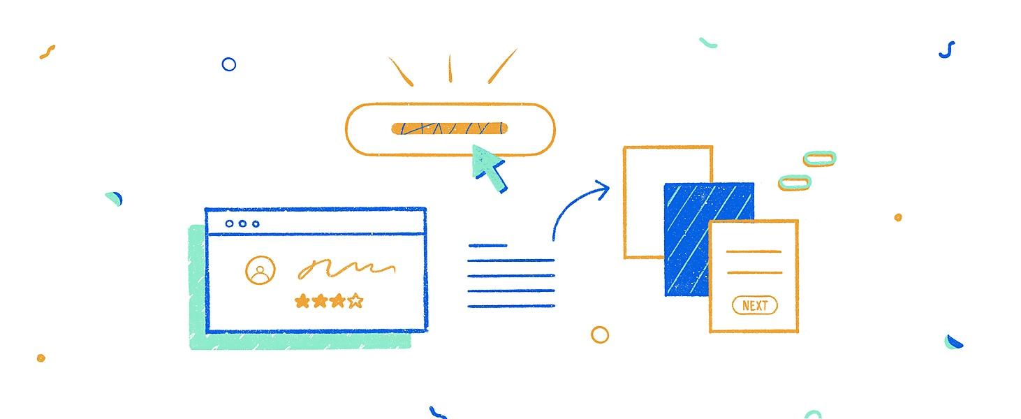
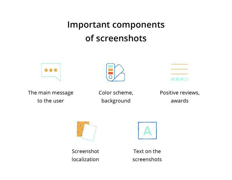
Well-laid main message
Regardless of the chosen style of screenshots (see below), think over the main message you want to convey to your users. For example, it's always a good idea to illustrate the capabilities of your application, but try to present them as benefits, not as a list of features. People are hoping to solve their problems or fulfill their dreams with your mobile service, and you should help them. That is, what does your program do? What makes it different from the competition? What is unique about your app? By and large, you only have a few pictures to answer these and many other similar questions.
Color scheme and background
Much depends on the style of your application. Of course, you aren't limited to the color scheme of your mobile app interface but using it to some extent can be a smart move anyway.
Here are a few helpful tips related to choosing the color style of screenshots:
-
The colors should meet the message of your application. Let's say, if you have a game app, screenshots must reflect its nature with bright colors;
-
Ideally, the color schemes of the app and screenshots should be consistent with each other;
-
Don't turn your screenshots into a random bright spot. It won't do you (or them) any good;
Text on the app’s screenshots
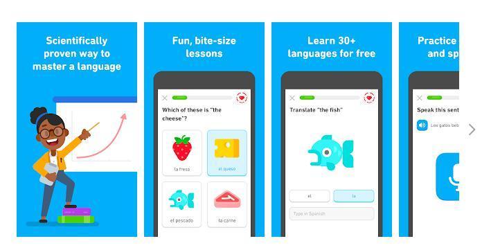
Recently, there has been a tendency to add short text to screenshots. Such a trend makes perfect sense: a capacious description helps the user grasp the main app task and understand what he has to deal with from the very first moments. The best solution is to use a call-to-action (or to verb the application's features).
However, don’t overdo it: the title shouldn't exceed two lines. Remember, brevity is the soul of wit, as they say. Keep this in mind as you consider and make screenshots styles.
BTW!
According to statistics, screenshots with thoughtful descriptive text have a better rating compared to examples without a title at all.
Screenshot localization
Many app owners underestimate the impact of localization on the success of mobile services (which is very short-sighted, let's say right away). Localization is needed at all stages, including the app screenshot creation. And it’s not just about text translation; localization is more than that.
You’ll have to fully adapt your screenshots to the local market, based on its cultural and linguistic characteristics. You may need to change the color palette or add an image of a person of a specific nationality (or something else). It much depends on the traditions of the country in which you plan to promote your product.
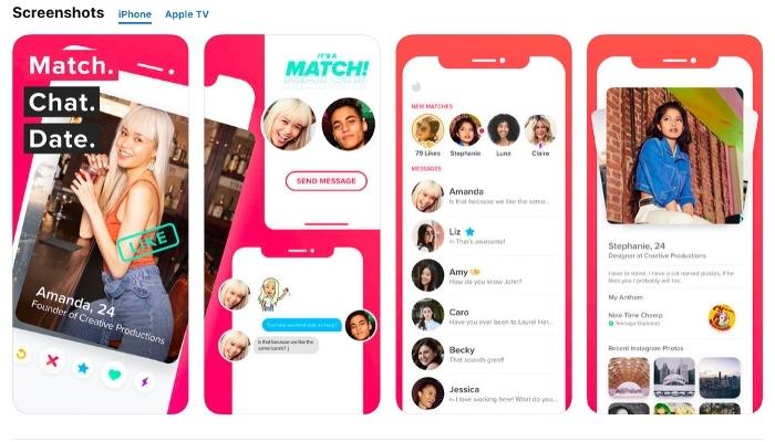
This is what the popular dating app looks like in the US market.
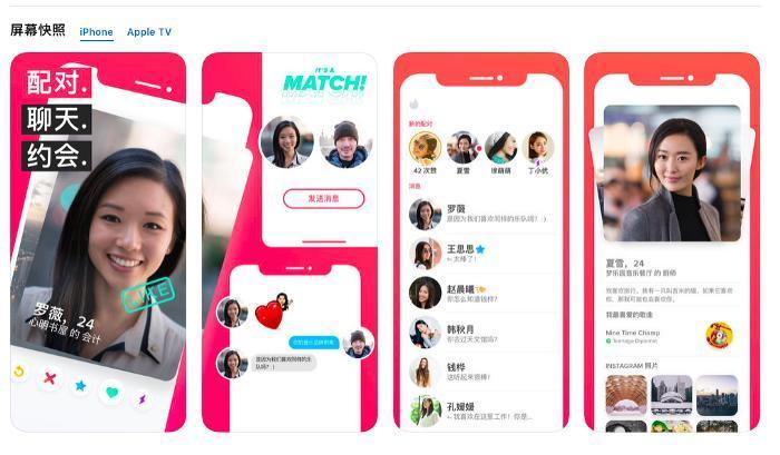
And that's how it looks in Asia.
Other instances of effective ways to localize screenshots:
-
Uber wisely approached the localization of its app's screenshots. The company not only translated the texts but also paid attention to the smallest details (say, in the US and Japanese versions, we see different currencies and maps in the pictures).
-
FiftyThree decided to adapt its Paper app for the Asian market and conducted additional research on local consumers. As the analysis has shown, multi-colored backgrounds (in comparison with monochrome ones) work better in the Asian market. Result: conversion increased by more than 30%.
Positive reviews and awards
You shouldn't be too modest and silent about your achievements. If your company has something to be proud of, reflect it in the app screenshot creation process. Positive media reviews, awards, favorable consumer feedback, and the like might help you reach a larger audience.
How to select the best style of an app screenshot?
There are different screenshots styles. Basically, choosing one of them depends on your app type and its target audience. In some cases, you should focus on soft natural colors and strict symbolism, in others, you have to show your imagination and use a certain non-standard approach.
Let's take a closer look at the issue.
Vertical & Horizontal orientation
Before diving into the screenshots styles discussion, let's mention the dilemma of all designers and marketers, namely: which orientation type to choose, portrait (vertical) or landscape (horizontal) one?

In most cases, it’s better to stick to portrait orientation: these screenshots are easier to view, and the user can see several pictures at once without additional scrolling.
However, the situation is changing when it comes to the gaming area: here the horizontal orientation holds the leading position. The fact is that gamers are used to the landscape type of screenshots.
Okay, we’ve figured out the problem of picture orientation, now it's time to move on to describing each specific style of screenshot. Let’s get started?
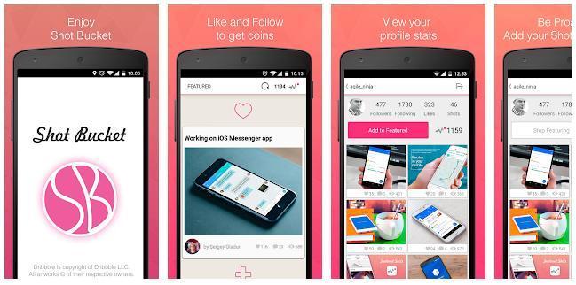
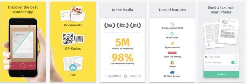
Classical approach
In the classic design, the screenshots show the application itself without any improvements and decorations. And let's say right now: such a way of presenting your app is a bit outdated and looks boring, which means it's bad for promoting a new product. Although skilled experts manage to make screenshots of this type quite appealing and stylish too.
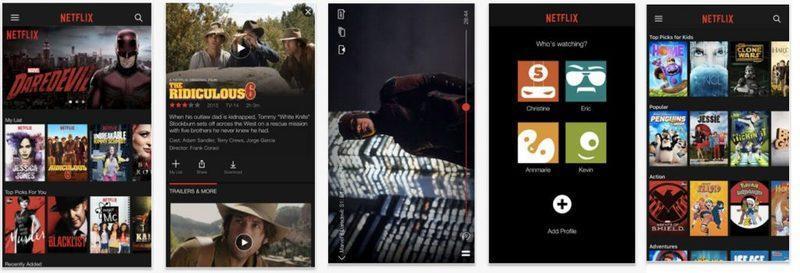
The Netflix variation inspires respect, doesn't it?
Why is the classic approach good?
It is easy to create and clearly demonstrates the interface of your mobile service.
Cons of the classic approach:
As we’ve already said, this option is outdated and rarely looks advantageous (especially against the background of competitors).
Who benefits from using the classic type of screenshots?
The classic approach is good if the time factor is critical. It is most often used by creators of gaming and fitness applications, as it is a great and simple way to show the value and benefits of the mobile program.
A device on a colored background
Here we see a device (smartphone) on a specific colored background (sometimes there is also a descriptive title). The smartphone shows the app interface (an example of how the application works, its main features, etc.). It looks pretty impressive with the right approach.
Why is it good?
-
creating an app screenshot in the style in question isn't a complicated task;
-
you have a chance to resort to descriptive text to convey the benefits of the application;
-
why not use a background color reflecting the UI of your app?
Main cons:
-
Google allows images of any Android device to be used, but, as we mentioned at the beginning of our article, the situation is a bit more complicated when it comes to creating styles of App Store screenshots (at least, nowadays, everything may change in the future). As you remember, Apple has its own rules, and you can't image the iPhone in your screenshots. The solution is to choose a neutral frame with rounded edges, a kind of conventional representation of a smartphone.
-
The scheme is very popular, and your application runs the risk of getting lost among other similarly designed solutions.
Another good example of a colored background style.
Who benefits from using this style of an app screenshot?
The style would come in handy for all categories of applications.
A device on a blurred background
The style is similar to the previous one, only a blurred photo should be used as a background, which makes the image more modern and stylish.
As to the pros and cons of such an approach to the app screenshot creation, they resonate with what we wrote above (describing screenshots with a colored background). We can only add that the style is especially popular among cooking apps and all sorts of mobile photo editors.
Panoramic style of screenshots
The panoramic style invites us to plunge into a kind of story when each screenshot is a continuation of the previous one. We see a certain logical plotline, and the app owner's task is to come up with something to tell the user to interest him from the first moments.
Why is it good?
The panoramic approach to announcing the capabilities of your application looks really interesting and easily invites the attention of users. However, it is very important to hire an experienced designer to help you create a beautifully presented sequence of your app’s screenshots.
Main cons:
As we’ve already said, creating a logical panoramic presentation of your application's features isn’t an easy task, and you cannot cope with it without professional skills.
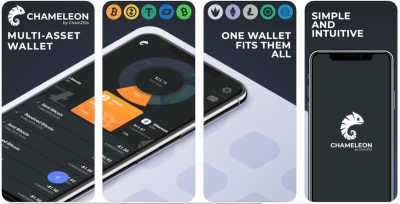
Another application (digital wallet, see details here) with a page designed in a panoramic style.
Who benefits from using the panoramic style of screenshots?
The panoramic style is great for any category of mobile services. However, it is most popular among video and music applications.
Usage guide
In this case, we’re dealing with a set of screenshots, which is also a guide to using the application.
Why is it good?
You explain how to use your application properly and advertise its core features at the same time.
Main cons:
Let's face it, such a usage guide may seem boring... and your explanation might sound obvious.
Who benefits from using the usage guide?
A usage guide is a good type of screenshots presentation only if your app requires more detailed explanations (say, if some features aren't obvious).
Real-life use
That's the case when the user has the opportunity to see your app in real-life conditions. The style is undeniably bold, bright, and unusual.
Why is it good?
The style has visual appeal and easily entertains, it attracts users. That's exactly what you need, right?
Main cons:
There are many examples of designers overdone in their attempts to create something spectacular; as a result, details take the attention away from your application. So be careful when using such a type of screenshots.
Who benefits from using the style in question?
If you know how to play up this idea, full speed ahead! Your audience's interest is guaranteed.
Emotions
The next approach to creating an app screenshot can also be called a "promotion" or even a "banner ad". It’s a sort of emotional way to tell the user about your application's features.
Why is it good?
An emotional and promotional presentation of the program's capabilities will help the application stand out, become more visible (after all, other app owners usually use more traditional styles to show their products).
Main cons:
Advertising associations can scare off a number of users. Plus, such an approach requires a lot of design skills.
Another example of an emotional presentation of app capabilities.
Combined type of screenshots
As the name suggests, that's a combination of two or more screenshots styles. There is no need to stick to just one option. The main thing is to maintain the golden medium.
Why is it good?
-
the possibility to implement the most effective elements of each style;
-
high level of user engagement.
Main cons:
It's easy to overdo it and get conflicting results.
Who benefits from using the combined style of an app screenshot?
The style is applicable to any mobile program.
Additional secrets for creating an app screenshot
Pay attention to the following points, and your App Store and Google Play page will easily grab the user's attention.
-
Analysis of the target audience, an important step on which the format of the presentation of your visual content depends. What do your users expect to see? What do they need? The answer to these questions will help you decide on the screenshot styles.
-
Analysis of competitors. It's also important to research and analyze other apps in your category. Of course, there is no point in completely following the example of competitors and copying their colors, texts, stylistics, it's enough to figure out (in general terms) what your potential customer is used to seeing. Perhaps you should surprise your user by offering him something original and unique, but whether the game is worth the candle is up to you.
-
Google Play vs. App Store. Android and iOS users may have different preferences and expectations, so it is better to have 2 sets of app’s screenshots prepared.
-
Creating a favorable first impression. The 1st two screenshots are the most important because 60% of users are too lazy to scroll through your entire gallery. These screenshots should be interesting, vivid, and reflecting the essence of your application.
-
Focus on new features. If you have had a major update to the app functionality, show the changes and improvements in your screenshots. Users should see all the exciting new benefits of your application.
-
A/B testing. Take multiple sets of screenshots and conduct A/B testing. Screenshots getting a higher conversion are the perfect solution for your app page design.
-
While Google Play offers a special console to perform A/B testing, iTunes Connect doesn't provide you with such a possibility. However, you can always use third-party tools (say, Storemaven, SplitMetrics, or Asogiraffe).
-
With the release of iOS 13, a dark theme appeared in the App Store, which led to one significant problem: sometimes your graphics look different on a dark theme than on a light one. Therefore, when creating styles of app store screenshots, don't forget to test the created designs in different versions.
-
-
Video preview. A video preview (promo video) is a great opportunity to further promote your application and its benefits. Adding videos to the App Store can increase conversion rates by 16%, according to SplitMetrics' report. StoreMaven's data is even more inspiring: having videos increases engagement and conversions by 20-35%.
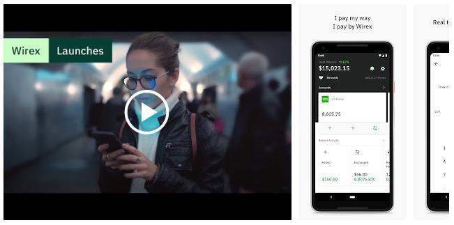
The application page with a video preview (Wirex, a banking app)
Best tools for creating an app store screenshot
So what tools will help you create beautiful screenshots? There are a lot of good and efficient solutions, we'll give an example of just a few of them:
-
Visme is a great choice for people without design skills. The price starts at $ 39 per month. And Visme doesn’t limit you to creating app store screenshots, you can use it to implement any design ideas.
-
Appure, an easy-to-use app for generating beautiful iOS and Android screenshots. Nice features include the absence of watermarks and the possibility to use a free plan.
-
Placeit is especially helpful if you want to show how your application looks in real life. The service can be used both free of charge (although the quality of the images leaves much to be desired) and by subscription (with access to more features).
Summary
Visual communication is undeniably faster and more effective than texting one. Therefore, appealing design and high-quality screenshots would be a valuable contribution to your future success by attracting more loyal users.