
Strong mobile market growth goes hand-in-hand with the increasing popularity of simple interfaces. Surely, it's just natural: the screens of our smartphones are limited in size, and UI/UX experts have to excel themselves to create something spectacular and effective at the same time. And a concept of minimal app design is one of the best solutions in this regard.
However, lack of space is by no means the only reason to take advantage of the minimalist design strategy. And we'll talk about others in our article. In addition, we'll discuss the proper approach to minimalism and the basic tips to follow. You'll know where to start and what to pay attention to first.
What is minimalism in mobile app design?
Appealing UI is a decisive factor in attracting users. Thus, their opinion should be taken into account in the process of the app interface development. And, as polls show, most people think the application must be not only visually inviting and catching, but also easy to use. This, again, brings us to the minimal design concept.
Definition of minimalist design
Minimalism in digital design is a harmonious combination of forms and functions. The basic precept is to make sure nothing distracts the user's attention from the main application task.
After all, we install Viber not to admire its interface, we need it for effective communication! And the rule applies to any mobile app. So don't overload your program with unnecessary effects. Nothing good will come of it.
What should minimal UI design look like?
Minimalist web and mobile app design should be concise, clear, and consistent. The interaction of the program's components must be aimed at solving the customer's problem, be it instant messaging, online shopping, or something else, which implies well-thought usability.
In essence, minimalism forces UI/UX experts to find a proper way to say more with fewer means. To achieve such a result, you need to follow certain principles. They’re simple and logical, and we’ll discuss them in due course.
Meanwhile, let's talk about the key minimalist app design benefits…
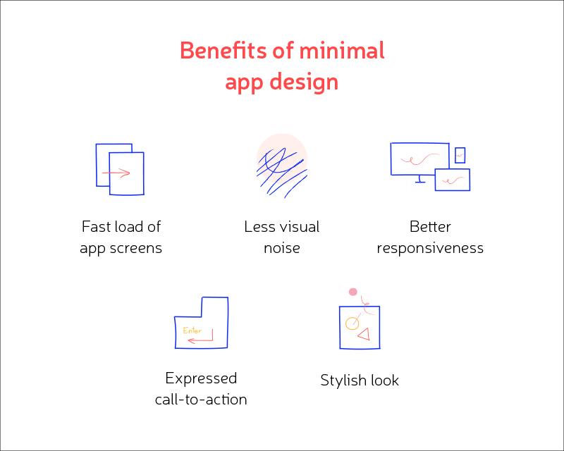
Benefits of minimal design
-
Fast load of app screens. The first advantage is due to the fact that you need to load a smaller number of elements, which positively affects the app speed.
-
Less visual noise. The 21st century gives us many perks, especially with regard to technology development. However, there is a downside either, namely, the need to constantly deal with the information flow. Besides, today we consume most of the data from mobile devices, which exacerbates the feeling of oversaturation and creates the effect of visual noise. And the minimalist approach to app design partly solves the problem.
-
Expressed call to action. Thanks to the minimalist design strategy, any emphasis will be striking. The laconicism and simplicity of the interface allow you to draw the user's attention to what you really want him to see.
-
Better responsiveness. This refers to compatibility with different devices, the ability of the interface to adapt to the screen of any resolution. If there are no extra elements, then achieving a responsive effect is easier, isn't it?
-
Stylish look. And finally, minimal UI design also looks very stylish, modern, and aesthetically pleasing.
Now let's consider the main steps to creating a minimalist design for your app.
How to implement minimalism in design
Once minimalism was considered a new design trend, which replaced the 90s with their thirst for everything fussy, excessively decorated, overloaded with details. Much water has passed under the bridge since then, and the idea of UI simplicity has undergone a lot of changes. A whole evolution of minimalism has happened... and that’s the topic we’re going to discuss right now.
So what should you remember when designing minimal apps in 2020?
Minimalistic principles of app design
The characteristics of minimalism include the following factors…
Simple Background
Web designers sometimes create complex background themes, say, those including photo images, but mobile UI experts have long abandoned such a practice in favor of simplicity and monotonicity. Too bright background under limited space complicates the process of navigating the application and slows down the loading stage, which isn’t good.
By the by, speaking of navigation...
Easy Navigation
As we keep repeating, mobile designers should be creative in small spaces, so there can be no question of bulky menu bars. You may use the “hamburger system” or hide the menu in some other way: it must be easily accessible, but not overlap the screen.
No Extra Details
All elements of the minimal design have to perform certain functions: a situation where every UI detail serves a specific purpose. It means you can safely get rid of app components with no direct tasks. They’re unnecessary.
This also applies to the text: reduce the number of words used and communicate as briefly as possible.
One Emphasis on the Screen

The idea is to strengthen the main message of your application and emphasize a call-to-action; the rest can either be removed or made less conspicuous. Thanks to these simple manipulations, users will pay attention to a specific screen area without additional clues on your part.
Say, in the example above, the emphasis is on the search bar, which is justified: Google is a search app, after all!
To highlight a specific UI element, you may use large fonts, vibrant color schemes, original design techniques, and the like. And in order to create the desired contrast, the remaining details should remain neutral.
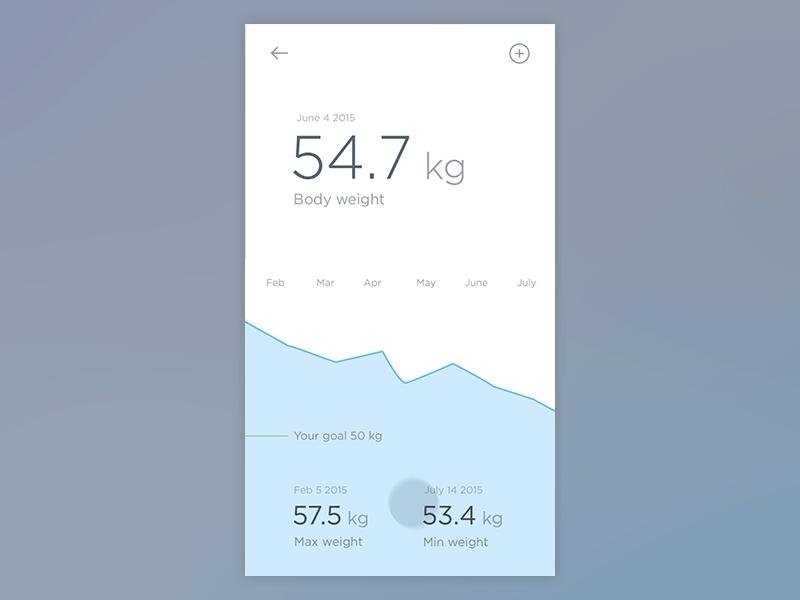
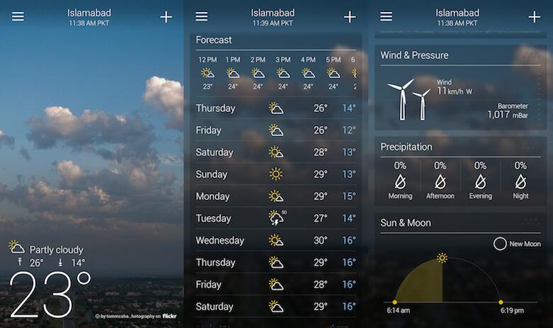
More Free Space
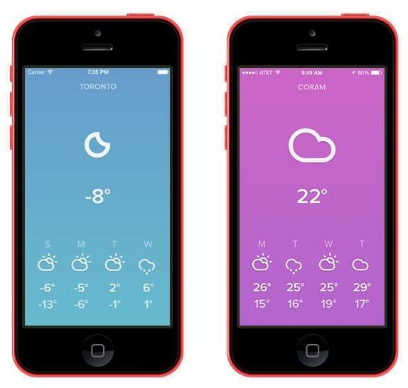
The next rule of the minimal design concept is connected with the previous one, namely: focusing the user's attention on a certain element (call to action), be sure to remember the space factor. Otherwise, you're unlikely to achieve the effect you're counting on.
By the way, free space implies emptiness but it doesn’t limit you to just white. And the interface of the weather application (see above) is a striking example of this.

Clear Color Schemes
A few more words about the color issue.
Though the empty space is not always white, don't go too far by using the whole range of the rainbow. The simplified color scheme looks much more attractive. And most importantly, it's compatible with the idea of the minimalist approach.
As an instance, we give a couple of options for proper color solutions:
-
The monochrome schemes consisting of different tones within the same color (saturation and brightness change).

-
The consistent scheme, created by using several colors (those that are next to each other on the color wheel).
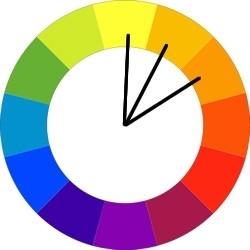
Of course, these are pretty primitive examples, and experienced designers take advantage of more sophisticated techniques when it comes to color selection.
Blur Effects
The blur effect is a good trick when the designer is unsatisfied with the plain background and want to give the application a layered effect without overloading the interface with unnecessary details.
The method is especially workable if you’re dealing with the multi-level UI and willing to stick to minimalistic design patterns anyway (which is very reasonable!).
Intervals Instead of Lines
Almost each app screen has to be divided into logical sections. And the simple solution is the lines... but it doesn't work well with the minimal design. To provide your interface with a clean and modern look, it’s better to use other ways to separate your content, such as block structures, intervals, color segregation, and so on.
Wearable Gadgets
Today, applications are installed not only on our smartphones. In recent years, wearable gadgets have also flooded the mobile market: smartwatches, fitness trackers, and more. And they ceased to be purely single-functional devices: with the help of the same Apple watch, we can answer a message or call and perform another simple action. It means there is a place for interface design either.
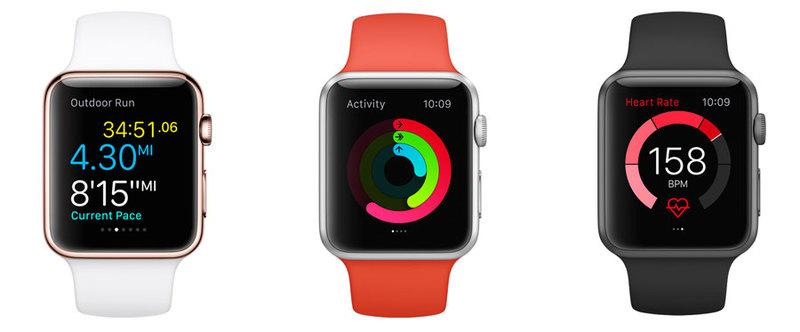
And that’s exactly the situation when it’s many times more important to find the right approach to minimalism: space with which you can operate is even more reduced in the case of wearable gadgets.

Intuitive App Interface
The whole issue comes down to the last significant point, namely, the creation of a user-friendly interface.
In the end, nobody wants to feel dull and dumb, and ill-conceived usability would give the user just such an undesirable impression. Therefore, your app interface should be intuitive, working on all devices in a similar logical way. The latter concerns the responsive UI, of course. And, as we've already said, achieving responsiveness in designing minimal apps is not so difficult.

Examples of minimalist app design
It’s always better to see than to just read or hear. Therefore, we're going to cite examples of several leaders of the mobile market who have successfully applied the minimalistic principles of app design to life.
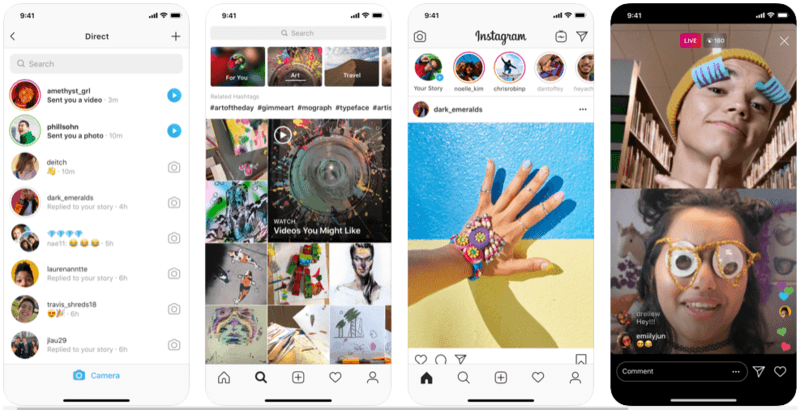
Instagram primarily works with images, and this alone makes it difficult to create a simple interface. However, after restyling in 2016, which affected not only the UI but also the app logo, the program embodied the main benefits of minimal design.
Airbnb
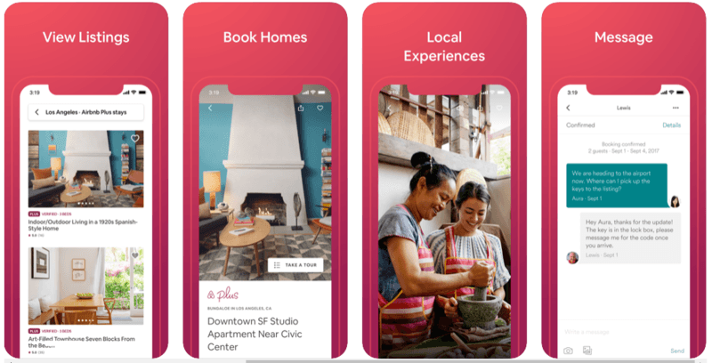
Instagram's restyling was being actively discussed on the net, however, nothing of the kind had happened after the wonderful transformation of Airbnb, which is a pity. After the redesign, the application became more stylish, modern, and functional: bold headings appeared, unnecessary colors disappeared, icons were simplified, and so on.
Apple Music
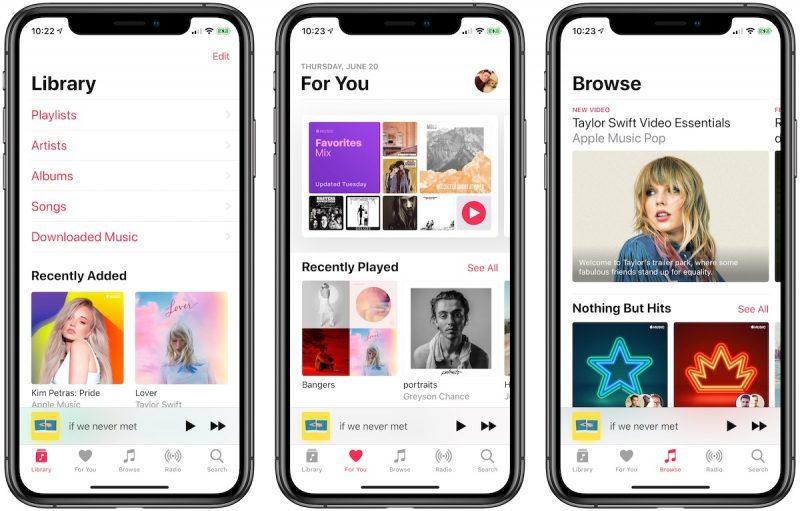
Steve Jobs was literally obsessed with clean, clear, minimalistic design patterns, and therefore all Apple products meet these requirements. Apple Music is no exception.
The application has undergone several changes, but, in general, it was originally aimed at the simplicity of forms and concise interface.
Summary
For years, we've been successfully creating apps, and minimalism is always taken into account in developing the UI. And now we’re ready to share our expertise with you by offering our services of gifted UI/UX experts.