

The application logo seems to be an insignificant detail, but it is this detail that invites our attention in the very first seconds. So you should do your best to make an app icon unique, memorable, and eye-catching. In the end, the user will interact with it on an ongoing basis, he'll see it every time he opens your mobile program.
By creating a beautiful, recognizable, capacious graphic symbol, you increase your chances of success. On the other hand, an ineffective, boring logo results in reduced app competitiveness.
But how to design an app logo? What to consider to get the desired result? How to avoid failure?
Okay, there are a few simple secrets, and we don’t mind sharing them with you. Enjoy our article, for we’ve illustrated all our tips with bright image examples so that you don’t have to guess what we’re talking about - you can see it.
What is the "Application Icon"?
Before deciding how to make a good app icon, it would be nice to understand what it is, an icon for a mobile application, to begin with.
Actually, we’re talking about a tiny symbol, a miniature picture, which personifies your service in App Store and Google Play, as well as on the user's device. And this small picture should visualize the essence of your digital product in the best way - be your brand "face", so to say. That’s why it's not enough to create an app logo with an appealing design - you need it to reflect the nature of your mobile program and convey your message to users visually (after all, your application carries a certain idea, right?)
Some mistakenly confuse the app logo (icon) with the company one. Of course, there is something in common, but the difference is significant: in the approach to work, in tools, in the design process, and, therefore, in the criteria of success.

The company logo is usually of a higher level (after all, sometimes a business manages a few different products and services). Such a logo is a vector element, which can be of any shape and type. It is easy to scale to be used in various marketing and corporate activities.
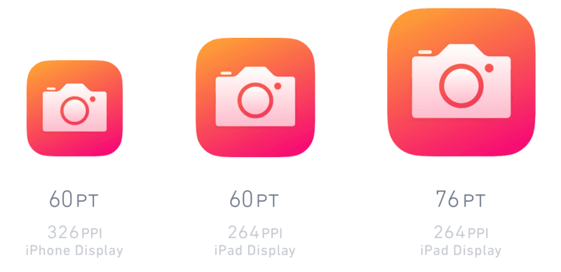
However, the requirements for the application logo are stricter. It should be of a certain shape and size to match other app icons on the user's smartphone screen. A hired designer usually develops a whole set of PNG files of different sizes - from small (29x29) to large ones (1024x1024).
You’re welcome to create app icons yourself, of course, there are many suitable design programs (Sketch, for example). But in fact, it is much wiser to find an expert who knows how to make a good app icon and has extensive professional experience.
Why Do You Need a Perfect Logo for Your Application?
AppStore and Google Play have a lot of boring and banal icons. Yours must be different because it is your visual asset and the strongest connection with the user. An app logo is not a makeweight, that is, the last thing to remember about; conversely, it’s an important part of the entire application development process.
Therefore, you should think carefully about how to create an icon for the app. Though if you are not convinced yet, we’ll give a few more reasons…
Why make app logos so crucial?
-
A visual way of communication. It might surprise you, but a logo is another way to stay in touch with the user. After all, if you create an app icon properly, it starts messaging your brand idea (which we've already mentioned above). That is, you communicate with consumers through visual means.
-
An opportunity to stand out from the competition. Your company is hardly the only one on the market, therefore, you have competitors. How to stand out among them and become a leader? There are many ways to achieve such a goal, and a speaking logo visualizing your app essence isn't the least of them.
-
Improved marketing. As you can see, there are many reasons why you should figure out how to design an app icon, and one of them is to get another marketing tool. Even such a little thing as a logo serves promotion purposes (with the right approach and use).
-
Better user experience. A satisfied user is easier to monetize, which means the UX factor should be taken into account. So why not create an app icon, which evokes pleasant associations in the consumer and brings him bright feelings? If a user likes an icon, he'll be more loyal to the application itself too (therefore, the user experience is improved).
How to Make an Icon for the App?
Of course, we cannot, within the compass of this article, teach you how to draw icons on a professional level or how to use Photoshop. However, we’re happy to give you some tips that will be useful to anyone who wants to know how to design an app logo.
#1. Exploring associations
Start by drawing up an associative series. What emotions should your logo evoke? What images and symbols are associated with it? By listing the sort of keywords describing your application, you can figure out how to proceed. Your task is to make an app icon revealing the essence of your product.
#2. Competitive analysis
Suppose you've compiled a list of associations. Therefore, it's time you studied your competitors.
Analyze what they offer to users. You have to create the app logo, which is better than these competing icons. The goal seems too ambitious, but do your best to achieve it (or get as close to it as possible).
#3. The main purpose
How to design an app logo so that the idea and purpose of your mobile service are clear at first glance? Well, the question is tricky! To answer it, you have to find out what consumer problems you solve and what user needs you meet. These answers should be transformed into visual images that everyone can understand and grasp.
#4. Learning your market requirements
It's also important to understand which market you'll be working with. Let's say, the requirements for medical services, including mobile ones, are rather strict, so there is no room for imagination. No creativity is allowed, just follow the rules!
Another good example is an application available worldwide. In this case, it is important to use clear and universal visual language.
#5. Determine the priority of the size
There are two approaches to the development of the logo. The first one is to make an app icon in a large size with maximum detail and work out smaller versions based on it.
If you don't like the above method, create an app logo in the size that is considered the most requested. You can modify the rest of the variations as needed.
Although, frankly, you had better hire an experienced professional and let him choose the best way to act.
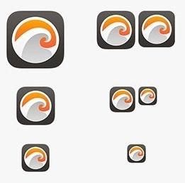
#6. Need a few logos? Create a set!
We suggest that you create app icons at once and in a single style if your project requires more than one of them. Build a whole set with all the logos designed in the same way (color, details, contour thickness...). So you can ensure a harmonious and memorable interface design.
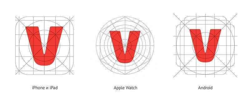
#7. Decide on the platform and follow the guidelines
Logos don’t exist by themselves and should fit into the interface. This means that, while remaining unique, they should not look alien alongside the icons of competitive applications. Therefore, the question of how to create an icon for apps starts with a study of the system manuals:
-
Material Design (Android). Here you can read about the style, animation, components, patterns, layouts, and usability, as well as download materials to help the designer.
-
The iOS Human Interface Guides from Apple are useful if you want to make an app icon for the iPad or iPhone.
If you need to create an app logo for different platforms, you can take one version as a basis and just make the necessary stylistic adjustments for others.
All icons, detailed and simplistic, creative and ordinary, have something in common: they all try to stand out from the competition and attract the attention of the user.
How to achieve this aim? We’ve prepared a few useful tips for you…
Tips for Successful App Logo Development
Sometimes a logo is just a couple of strokes, but it still works and attracts users' interest. They like what they see and are more willing to download the application itself.
But how to make an app icon as successful as these masterpiece laconic examples? What's their secret? Well, we have a couple of tips, which you might find helpful.
#1. Scalability
It’s not enough to create an app icon, which looks beautiful and conveys the product idea. It’s also important that the logo works in different sizes (after all, you don’t know which model of the smartphone a particular user has).
So you can't do without the scalability factor.
And by the way, the more detail a logo has, the less it scales.
Well, the point is really crucial and deserves a separate discussion.
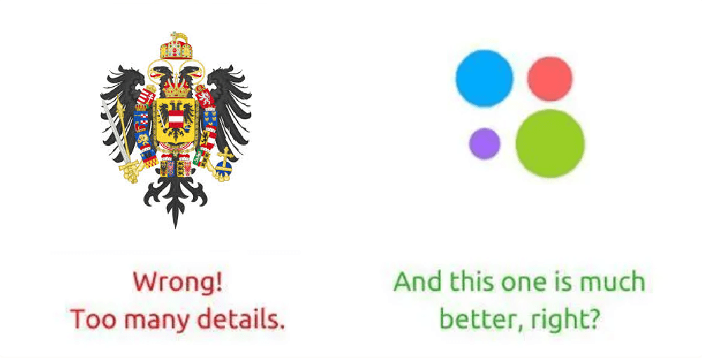
#2. As few details as possible
The logo takes up minimal space, so there is no point in adding a huge number of elements to it. Believe us, you can hardly make app icons better just by overloading them with unnecessary details (no matter how beautiful these details might look).
The top logos are those that deliver a company's message using the simplest visual means. Follow their lead, and you're more likely to create something equally awesome.
#3. A unique approach to being recognizable
Now we’d like to discuss the problem, which is perhaps the most difficult to solve. To tell more truly, it is quite solvable, you just need to show imagination.
So what's the crux? You have to figure out how to design an app logo, which looks unique... and fits your market category at the same time (if you remember, sometimes there are certain requirements for application design, and they cannot be ignored).
Sounds complicated, right? Don't worry, we don't mind explaining to you what to focus on so that your icon is recognizable:
-
How about playing with colors?
-
In some cases, it is enough to choose a rich color scheme to achieve a stunning recognition effect.
-
-
What makes them special?
-
Find and analyze a couple of logo examples that you like. What is so special about them? No need to copy their strategy, just try to get inspired to create app icons of your own.
-
-
Aren't you plagiarizing someone else's idea by any chance?
-
Being inspired is one thing, but plagiarizing is another. 'Second-hand' ideas are a clear path to failure. Come up with your own approach to the style of icon design you're so fond of.
-
-
Is your icon too detailed?
-
Of course, there is nothing easier than making a logo unique by overloading it with decorative elements and the like. However, it won't become recognizable... and even if it does, you won't benefit from it. Just imagine: "Do you remember that awful logo? It has so many details, it’s impossible to remember them all"
-
Now you know how to make a good app icon (and recognizable!), but we have a few more tips to share with you.
#4. Less talk, more work!
Also, there is no need to include the application name in the logo itself. This makes no sense since the name will be written under your icon anyway (on the screen of the smartphone).
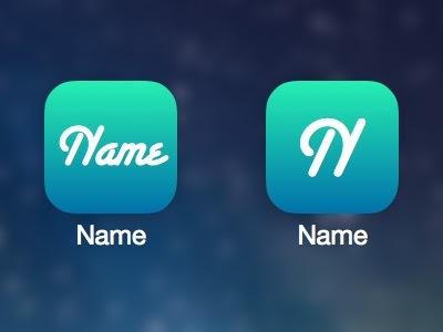
In short, try to create an app logo, which communicates with the user visually, without words. Words will be needed too, but later, when the application is downloaded, opened, and ready to use. In the meantime, resort to symbols, colors, shapes, and more, to make your icon special.
#5. Color does matter
As we've already written above, the right color scheme can make an app icon more recognizable and provide it with its own character. But how do you choose such a scheme? Start by looking for answers to the following questions:
-
What color emphasizes the individuality of your brand?
-
What colors characterize your application?
-
What color have your competitors chosen?
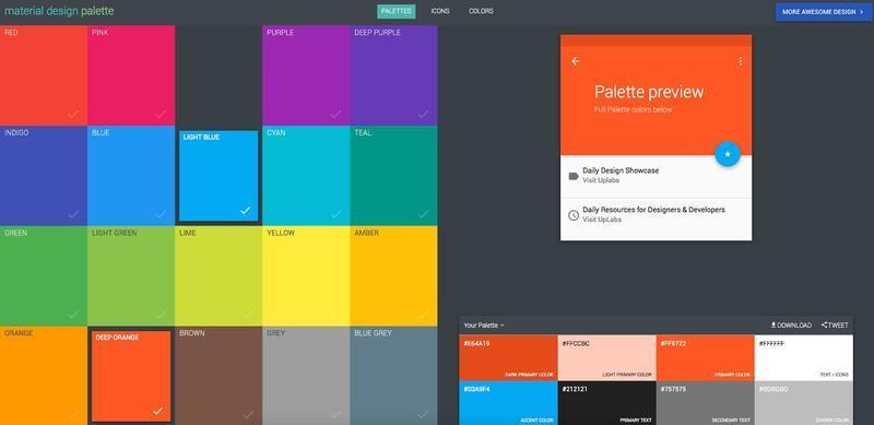
And one more thing: it’ll be useful to look into Material Design, compiled by Google to help creative experts. It describes how to design your app icons so that they meet all the rules and requirements of Google Play.
#6. Be informative
There is one more tip, which is by no means a mandatory rule, but it can make your job easier if you have no unique ideas of your own. In other words, if you don't know what to think up to make your logo look interesting and cool, try to illustrate the essence of your digital product.
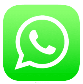
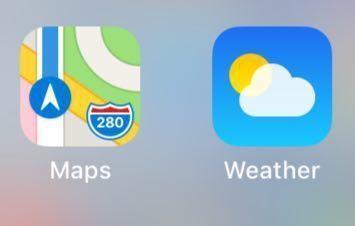
Let's say WhatsApp is focused on communication and therefore visualizes a phone receiver. Simple, clear, stylish, and without unnecessary details…
#7. How about the background?
Keep in mind that your application icon is going to be on the user's smartphone screen, and you cannot predict which wallpaper he'll choose. So you should find out how to make an icon for the app look good on any background (as much as possible).
![]()
#8. No photos, please!
Trying to make app icons unique with photographic images is a hugely disadvantageous idea. Perhaps, in some extremely rare cases, this technique might work as you want, but we wouldn't risk it anyway. There are other ways to achieve the aim.

#9. Perspective effect
You should create an app logo with a prospective effect only if you’re 100% sure of the result. Sometimes such an icon would look sort of outdated and old-fashioned. But why not test the concept? If you don't like what you see, you can always take a different design approach.
![]()
#10. Unified image
It's time to summarize our tips on how to make a good app icon. Uniqueness, informativeness, minimalism, and other factors are certainly important... but it's even more important to give your logo a comprehensive and unified identity. It should be a logical continuation of your brand and correspond to the interface of the application.
Some designers just use a single color palette to achieve the desired effect (it's a rather simple way to go but it may work!). For example, the lilac interface can be supplemented with a lilac icon.
Another way is to recall our tip #6 and make an app icon using symbols related to the functionality of your service.
The Best Way to Create App Icons
The network provides us with a great many free services, which help to create app icons. But this option isn’t always acceptable if you want to understand how to design an app logo, which really surprises the user (in a good way).
On the other hand, you can take advantage of resources like thenounproject.com where you’re welcome to buy a logo, and quite cheaply. It’s not the smartest approach, though, even if you need to save. The correct choice is to hire professionals who know how to make an app icon of any level of complexity.
Of course, don't expect to get the result in a few days after ordering the service. Usually, the process of building a logo for an application is multi-stage, and the timing depends on many factors.
But the most crucial is something else, namely: detailing information about your mobile service. Provide the specialist with all the data he asks for, he needs it to create an app icon, which meets your criteria.
Logo Testing
We can argue about how to design an app logo at length… but how to check whether you’ve achieved the result you want? Only through testing, of course!
Strictly speaking, it’s about two phases of testing:
-
Testing the logo idea on the user;
-
Technical logo testing.
#1. Testing the logo idea on the user
So you've come up with a logo idea and built a prototype. But what if your efforts go to waste, what if users don't like your app icon? We have to figure it all out before launching!
Actually, you’re facing two basic options:
-
Amateur (non-professional) approach. It is an ideal choice if you have to save money and cannot resort to professional help (the option described just below). The bottom line is simple: ask your friends and acquaintances to rate your logo. Convince them to be sincere and not compliment your idea if they don't mean it.
-
as an option, you can post the application icon on the social media page and ask everyone who wants to express their opinion about it
-
-
Focus group. The best way to check if your logo meets the target audience's expectations is to hire a specialist. He'll engage a focus group and professionally test your idea. You'll get the unbiased opinion of uninterested people, which means you can make the necessary adjustments before it's too late.
#2. Technical app logo testing
Let's say you’ve run the first round of testing to see if you were able to make an app icon matching the tastes of the average user. Now it's time to check its technical characteristics.
More precisely, you need to test the icon in as many conditions as possible. You must be sure it looks good on different backgrounds, in different sizes, and on the screens of different devices. Otherwise, you can create an app logo, which turns out to be a failure (at least, under certain circumstances).

Well, as you’ve probably already understood, the logo, despite its diminutiveness, plays an important role. And its development is a task of increased importance.
That's why we don’t recommend you figure out how to design an app logo on your own. Free resources and fumbling attempts to master Photoshop are not the way to go when it comes to the future of your mobile service. Only a professional would cope with your project at a high level.
Of course, the app icon design cost, in such a case, will be higher, but these financial investments are justified. One wrong step can lead to failing all your hopes of making a profit with the help of mobile commerce. So don’t skimp on hiring UI / UX experts.
We offer you our services. Our company specializes in mobile development, and therefore we are thoroughly versed in the creation of applications, which means we can make an app icon that will become an effective key to your future success. Examples of works of our designers are the best proof that we approach any task creatively and meaningfully.
If you don’t have an application yet, we are ready to offer you a turnkey service, starting with market research and ending with the publication of the service in App Store and Google Play. However, if you are not interested in developing the mobile service, we are more than happy to just create an app logo for you - perhaps, this will be the first stage of our mutually beneficial and fruitful cooperation.
We assure you, our UI/UX experts know quite well how to design app icons that will be just like you dreamed of.